Preview image. Unlock full-res
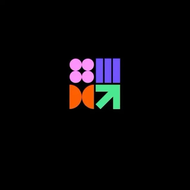
Playful app icon logo: 2x2 grid of geometric modules (pink circles, purple stripes, orange bow, green arrow) on black background.
Summary
A playful 2x2 grid logo: bright magenta circles (top left), purple vertical stripes (top right), burnt-orange bow shape (bottom left), and neon green arrow (bottom right), each in its own quadrant against solid black.
Visual description
Black square canvas divided into a 2x2 grid. Top left: four bright magenta circles arranged in a 2x2 pattern (two solid, two split). Top right: three purple vertical stripes of varying opacity, suggesting depth. Bottom left: two overlapping orange semicircles forming a bow-tie or hourglass silhouette. Bottom right: a solid neon green arrow pointing up and to the right. Each module uses pure, saturated color with minimal internal detail. The overall effect is a modular, icon-like system that feels both structured and energetic.
Key takeaway
The 2x2 grid constraint that ensures visual balance and modularity across four distinct shapes. The decision to use four completely different geometric concepts (circles, stripes, bow, arrow) while maintaining cohesion through color saturation and symmetry. The high-key palette against black, maximizing pop for small app-icon scales.
Reuse notes
Effective for consumer apps, developer tools, or SaaS products that want approachable energy without being childish. The grid structure scales well to app icons, favicons, and social-media avatars. Each quadrant can be replaced or reordered while maintaining brand recognition. Works best when each module remains simple and color-distinct; adding texture or gradients would undermine the clean, icon-like feel.