Preview image. Unlock full-res
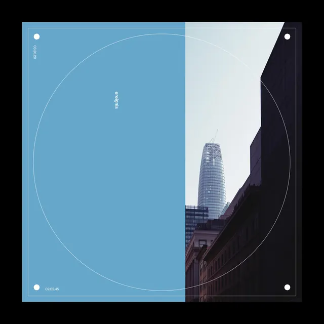
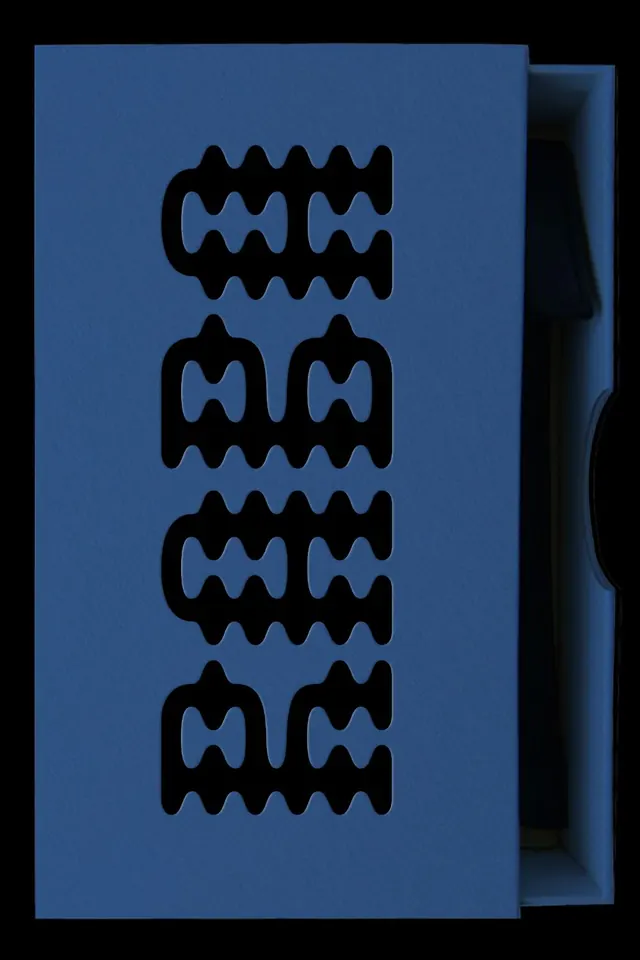
A logotype built from four horizontal rows of interlocking, undulating geometric shapes in solid black against a cool blue ground.
Summary
A logotype built from four stacked rows of interlocking, undulating geometric shapes in solid black against a cool blue ground.
Visual description
Four horizontal bands of identical wavy, symmetrical forms fill the central field. Each row consists of two mirror-image shapes with organic wave edges that interlock seamlessly top-to-bottom, creating a seamless rhythm. The shapes are pure solid black with crisp edges; they repeat vertically to establish a dense, modular pattern. The ground is a uniform slate-to-medium blue, with a darker gradient or shadow visible along the right edge suggesting physical depth. The composition is tightly centered and balanced, with no text or additional embellishment.
Key takeaway
The economy of using a single repeating motif to build a complete mark. The contrast between the organic wave edges and the rigid stacking creates visual tension. The proportional relationship between the black forms and negative space within each row is the structural key.
Reuse notes
Excellent reference for abstract brand marks, logos that need to feel sophisticated without illustrative detail, or modular identity systems. Works well at scale thanks to clean geometry and high contrast. The interlocking technique is reusable for textile, pattern, or three-dimensional applications.