Preview image. Unlock full-res
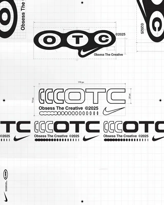
A modular letter-based logo for OTC (Obsess The Creative) using concentric ovals as letterforms, paired with Nike-style swoosh ornaments and grid-based construction guidelines.
Summary
A modular letter-based logo for OTC (Obsess The Creative) using concentric ovals as letterforms, paired with Nike-style swoosh ornaments and grid-based construction guidelines.
Visual description
Three concentric ovals form each letter (O, T, C), filled solid black with white counters, arranged horizontally and touching to merge edge-to-edge. A Nike-style swoosh curves underneath the cluster. The composition includes multiple scale explorations of the letterforms, all shown with geometric dimension lines, 170px width annotations, and clear grid overlays in light gray. At bottom, full-width horizontal treatments repeat the letters with the swoosh and decorative dot-line elements aligned to construction guides. Monochrome palette throughout.
Key takeaway
The strategy of using positive/negative overlap to merge distinct glyphs into one unified mark. The lightweight construction grid showing modular dimensions, demonstrating how the letterforms scale and align. The smart use of a recognizable brand icon (the swoosh) as a secondary ornament that reinforces identity without competing with type.
Reuse notes
Strong for tech, creative, or agency brands that need a geometric, precise identity. Works particularly well as a small lockup or icon. Grid construction format is ideal for brand-guidelines documentation. Scale and color simplicity make it responsive across sizes.