Preview image. Unlock full-res
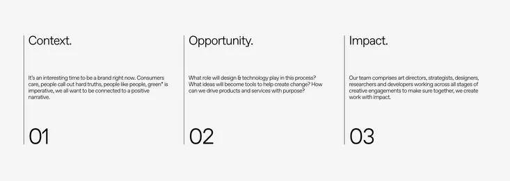
A minimalist three-column type layout presenting Context, Opportunity, and Impact frameworks on a light gray ground.
Summary
Three equal columns divide a light gray field, each labeled with a strategic concept (Context, Opportunity, Impact) and paired with numbered sequential headers and descriptive body text.
Visual description
The layout is divided by vertical rules into three equal columns on a pale gray background. Each column opens with a concept header in medium weight sans-serif, followed by a paragraph of explanatory text in a smaller size, then a large display number (01, 02, 03) anchoring the base. The typography is neutral and legible, set in consistent spacing with clear visual hierarchy. Plenty of white space between columns emphasizes the separation of ideas and prevents visual clutter.
Key takeaway
The numbered section framework as a simple way to guide a reader through discrete ideas sequentially. How the large numerals serve as visual anchors without decoration. The restraint of one typeface and a single accent color strategy, making the information primary.
Reuse notes
Perfect for consulting decks, strategic frameworks, annual reports, or any client-facing material where clarity and authority matter. The three-column grid scales well to print or web. Works especially well for frameworks with three components (problem-solution-outcome, past-present-future, context-opportunity-impact).
More like this




Keep what you find
A free account saves references to boards and can send you a weekly email of picks based on what you save.
To see every result, go Pro.