Preview image. Unlock full-res
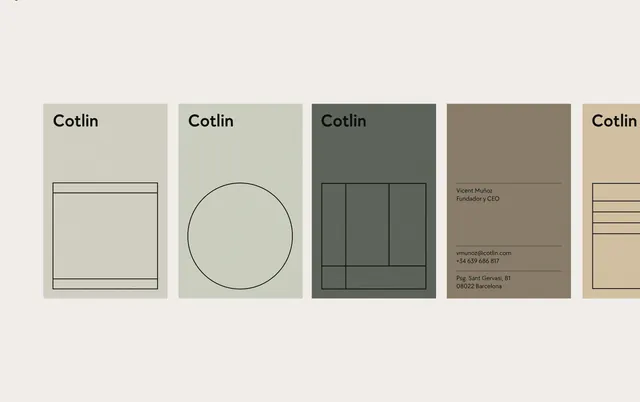
A type specimen showcasing the Cotlin font across five horizontal cards in a muted earth-tone palette with grid and geometric composition studies.
Summary
A modular type specimen for Cotlin that demonstrates the typeface across five cards, each using a different composition strategy: grid, circle, three-column layouts, contact card, and horizontal lines.
Visual description
Five horizontal cards in sequence, each with a muted background in soft taupe, sage, dark green, warm brown, and light cream. Each card displays "Cotlin" as a headline in the sans-serif typeface, then a geometric composition study below: a thin-lined rectangle (card 1); a simple circle (card 2); a three-box grid (card 3); a contact card with address and phone details in micro-type (card 4); horizontal line rules (card 5). The compositions are restrained, favoring white space and line weight over imagery. Type is consistent, clean, and unhurried.
Key takeaway
The discipline of showing a typeface in context through system use, not isolated specimen sizes. Each card teaches a structural principle (hierarchy, emphasis, structure, information density, baseline rhythm) without a single diagram. The muted-palette card sequence builds confidence in the type's versatility. The modular card format itself is reusable for any sans-serif family.
Reuse notes
Excellent reference for designing type specimens or brand-identity system posters. The approach works best for clean geometric sans-serifs; highly stylized or display fonts need different showcase strategies. The quiet color palette is sophisticated but risks anonymity in a crowded portfolio. Scale the grid structures into posters, web type scales, or application guidelines without change.
More like this




Keep what you find
A free account saves references to boards and can send you a weekly email of picks based on what you save.
To see every result, go Pro.