Preview image. Unlock full-res
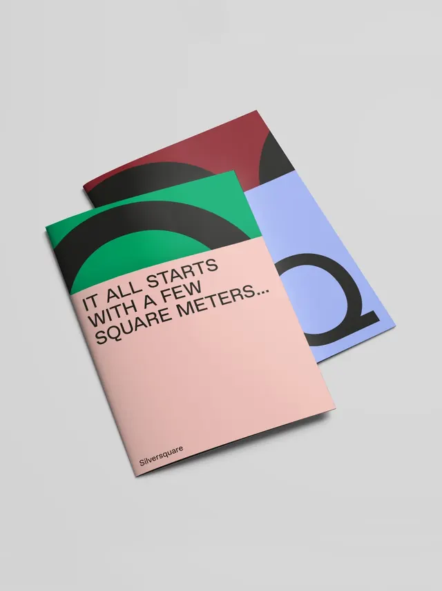
A typography specimen arranged across three overlapping geometric cards in a warm, layered composition featuring dusty pink, teal, and offset type treatments.
Summary
A design-focused type specimen presented across three angled, layered rectangular cards in a warm muted palette, with typographic elements and geometric shapes in coordinated dusty tones.
Visual description
Three card stocks arranged in a staggered, overlapping stack. The front-most card is a warm dusty pink with black sans-serif text reading "IT ALL STARTS WITH A FEW SQUARE METERS..." and a "Silversquare" byline at the bottom. Behind it, a light blue-lavender card with a large black circular shape in the bottom-right corner. Behind both, a burgundy-red card with a geometric black curved form and a teal-green angular shape layered on top. The 3D perspective creates depth; shadows on the cards enhance the stacked effect. The typography is clean, modern sans-serif in black. The color palette is restrained but warm (dusty rose, muted teal, deep burgundy, soft lavender) with high contrast between type and card backgrounds. Geometric shapes throughout (curves, angles, circles) are rendered in black or complementary accent colors.
Key takeaway
The three-card stacked layout creates visual depth without requiring photography or illustration. The geometric shape system (curved forms, circles, angular elements) is consistent across cards and reinforces a structured brand language. The warm muted palette (dusty pink, teal, burgundy) reads sophisticated and contemporary without harsh contrast. The text placement on the front card draws the eye while shapes on the back cards add visual interest.
Reuse notes
Effective for editorial or branding projects where the design system itself is the message. Works well for design studios, publishers, or marketing agencies showcasing a modern, geometric language. The stacked card technique is tactile and memorable in both digital and print applications. The muted warm palette pairs well with sans-serif display type for editorial or cultural brands.
More like this



Keep what you find
A free account saves references to boards and can send you a weekly email of picks based on what you save.
To see every result, go Pro.