Preview image. Unlock full-res
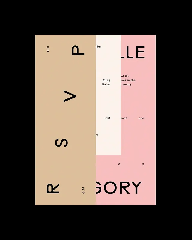
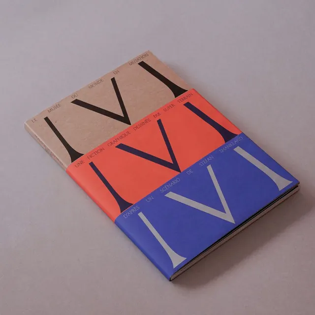
Type specimen layout splitting a tall rectangular format into three vertical color blocks: warm beige, off-white, and pale pink, with large geometric sans-serif letterforms scattered across the composition.
Summary
Type specimen using three vertical color fields (warm beige, off-white, pale pink) to showcase large sans-serif letterforms isolated at different scales and positions, creating a stark, editorial type system.
Visual description
A tall rectangle subdivided into three equal vertical sections. The left third is warm beige housing large, dark sans-serif capitals (P, >, S, R) scattered down the height with generous negative space and small gray text fragments layered between them. The center third is off-white, serving as a breathing pause with minimal type in dark and gray. The right third is soft pale pink containing additional typographic elements (LE, text fragments) at varying scales and positions. The overall composition is high-contrast with clear delineation between color zones; large individual letterforms function as graphic elements rather than continuous text, emphasizing the geometric properties of each character.
Key takeaway
Color blocking as a structural tool to organize letterform exploration. The stark isolation of large characters against quiet backgrounds, treating type as both readable information and abstract form. The editorial layering of different text scales and weights in a single zone to show systematic variation.
Reuse notes
Excellent for editorial design systems, literary/publishing identities, and contemporary branding seeking quietness and sophistication. The three-zone vertical split works well for campaigns or product lines with distinct sub-brands. The warm-and-cool color selection (warm left, cool right) is reusable shorthand for visual tension. Avoid using this approach if the target audience expects high energy or playfulness.
More like this






Keep what you find
A free account saves references to boards and can send you a weekly email of picks based on what you save.
To see every result, go Pro.