Preview image. Unlock full-res
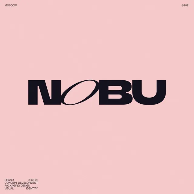
Bold black NOBU wordmark centered on pale pink, its O cut as a tilted ellipse, framed by small caption type marking Moscow, 2021, and the studio's services.
Summary
A logotype lockup centering a heavy black "NOBU" on pale pink, where the O is drawn as a steeply tilted ellipse, with small corner captions framing it as a branding case study.
Visual description
A near-square pink card with the wordmark "NOBU" set large and centered in a tightly spaced black grotesque. The letterforms are custom: the U is squared with rounded outer corners, and the O is replaced by a narrow diagonal ellipse that leans across the baseline, giving the otherwise upright word a single moment of motion. The fill carries a faint film grain. Four small all-caps captions anchor the corners: "Moscow" top-left, a "2021" copyright top-right, and a stacked services list (Brand Design, Concept Development, Packaging Design, Visual Identity) bottom-left. Everything else is empty pink.
Key takeaway
Distorting one letter, here the O into a slanted ellipse, to give a static wordmark energy without restyling the whole word. Using small corner captions to turn a bare logo lockup into a self-documenting portfolio card. The grain over flat color adds warmth to an otherwise clean mark.
Reuse notes
A reusable layout for presenting a single logotype as a case-study slide or social post: mark dead center, metadata pinned to the corners. The one-letter distortion trick works best when the rest of the type stays disciplined. Swap the pink for any soft brand tone.
More like this

Keep what you find
A free account saves references to boards and can send you a weekly email of picks based on what you save.
To see every result, go Pro.