Preview image. Unlock full-res
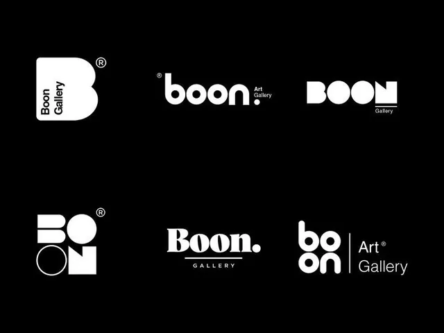
Six monochromatic logo variations for Boon Art Gallery, combining geometric shapes and type in different compositions on black and white backgrounds.
Summary
Six logo variations for an art gallery combining the wordmark "Boon" with stylized geometric marks, in strict black and white, showing different compositional relationships.
Visual description
Six distinct monochromatic logo treatments arranged on a black background, each using white, black, and gray. Top row: a rounded-square mark with "Boon Gallery" vertical, a horizontal wordmark "boon. Art Gallery" in geometric sans-serif, and a circular composition with "BOON" stacked and "Gallery" below. Middle row: geometric shapes spelling "BOON" using a circle, rectangle, and other elements plus a registered trademark symbol; a bold serif "Boon." wordmark with a horizontal line and "GALLERY" below; and circular "boon" mark beside "Art Gallery" vertically. Each variant maintains strict geometric proportions and negative space. All use consistent sans-serif or serif weight. Type is legible at small scale. No color, no imagery, no decorative elements beyond the mark and type.
Key takeaway
The system shows how a single brand name can support multiple compositions (vertical, horizontal, mark-only, mark-with-type, stacked) without breaking visual consistency. Using only geometric shapes and tight letter-spacing creates a premium, refined feeling. Maintaining the mark/type relationship across all versions ensures a coherent suite where each variant is functional in different contexts.
Reuse notes
Strong model for cultural or luxury brands where restraint and elegance signal high quality. The monochromatic approach means these marks work anywhere without color dependency. Different proportions allow use in narrow horizontal spaces, app icons, or large signage. Be cautious with the very small mark (top middle row) for screen use below 48px.
More like this







Keep what you find
A free account saves references to boards and can send you a weekly email of picks based on what you save.
To see every result, go Pro.