Preview image. Unlock full-res
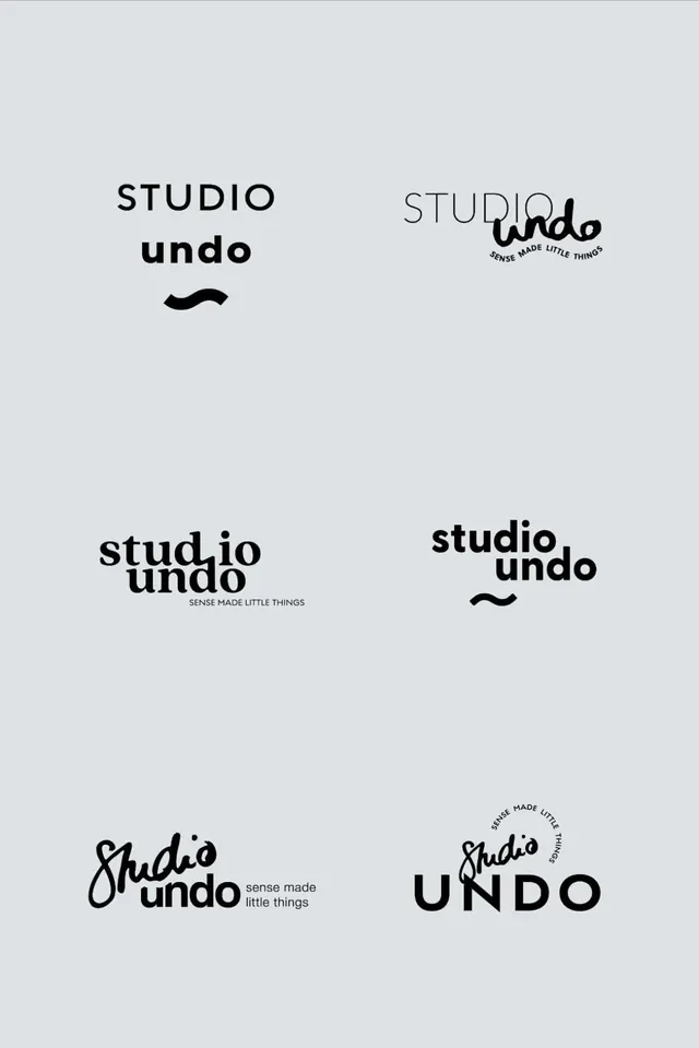
Type specimen grid displaying seven logo and wordmark treatments of 'studio undo' in sans-serif, script, and hybrid typographic styles on light gray background.
Summary
Branded type specimen showing seven logo iterations for Studio Undo: lockups mixing clean sans-serif with handwritten script accent, arranged in an informal grid on light gray.
Visual description
Seven logo treatments occupy a light gray background in a loose rectangular grid. Top row shows three variations: stacked "STUDIO undo" in sans and sans+handwritten script, plus a thin-serif version with handwritten "undo" accent. Middle row presents two more lockups, one with subscript tagline "SENSE MADE LITTLE THINGS", each shifting the relative weight and scale of sans-serif "studio" against fluid script "undo". Bottom row displays three final versions, including an all-caps "UNDO" variant and a circular seal with script inside an all-caps ring. All treatments use only black type on white, with generous breathing room between specimens. A small curved swoosh underline appears on select versions as a unifying accent mark.
Key takeaway
Presenting 7 tight variations in one view proves the system's flexibility without needing a 50-page guide. Each wordmark trades emphasis between structured type and handwritten flow, showing how the same two ingredients can feel different. The simple accent mark (swoosh) ties unrelated versions together.
Reuse notes
Essential reference for creative or design studios needing to justify a typeface-based identity and show versatility. The monochrome presentation isolates the typography story; translate to 1-2 brand colors once locked. Use as a pitch template or internal brand document. Handwritten elements require a custom script or quality font; weak script execution will undermine the elegance of this approach.
More like this




Keep what you find
A free account saves references to boards and can send you a weekly email of picks based on what you save.
To see every result, go Pro.