Preview image. Unlock full-res
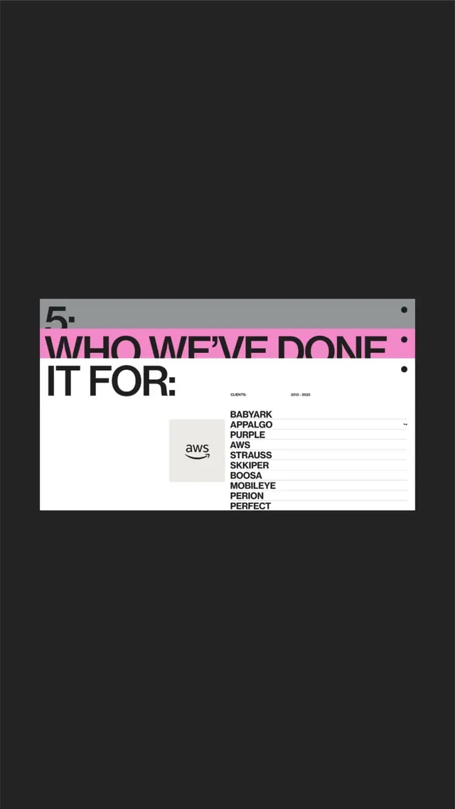
A studio portfolio system pairs a magenta accent bar with authoritative sans-serif listing a client roster over neutral backgrounds.
Summary
A portfolio system using a bold magenta bar and brutalist typography to list clients (AWS, Babyark, Appralgo, Purple, and others) against a divided gray and white background.
Visual description
Composition divided horizontally: large gray upper field, white lower field with a magenta bar cutting across the center. The magenta bar contains "WHO WE'VE DONE IT FOR:" in bold all-caps sans-serif. Below, client logos and names are set in a tight stack: all-caps sans-serif in 2023-2025 date range. AWS logo appears on the left in a light-gray box. The typography is direct and undecorated; the magenta bar provides the only color accent. Brutalist rejection of ornament; the magenta functions as pure information separator.
Key takeaway
The magenta accent bar is a simple but forceful device: it divides content zones and claims attention without imagery. All-caps sans-serif and high contrast (black type on white, magenta on gray) reinforce authority. The client list is typographic only, no logos needed.
Reuse notes
Suitable for design studios, consultancies, and production companies presenting work or credentials. The magenta can be swapped for any bold color. Works well at large scale or printed. Not ideal for client-logo-heavy portfolios where logo clutter would undermine the brutalism.
More like this






Keep what you find
A free account saves references to boards and can send you a weekly email of picks based on what you save.
To see every result, go Pro.