Preview image. Unlock full-res
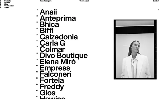
A numbered directory listing 15+ names in heavy sans-serif with a portrait photograph in black frame, header nav, and designer credit 'Roberta Ungaro Commercial.
Summary
A portfolio directory page using numbered rows of heavy sans-serif names set across the left, with a right-aligned black-framed portrait and minimal navigation and branding elements.
Visual description
A clean white background layout split into two parts: the left two-thirds is filled with a dense numbered list (1 to 15+) of names in large, uniform sans-serif typeface, aligned left. Each name is bold and black. The right third contains a symmetrically framed black-bordered portrait photograph (showing a figure in a light blazer looking upward). Above the list sits a minimal header with navigation ("Portfolio", "Beauty", "Kids", "Commercial", "About") aligned left and right ("Roberta Ungaro", "Commercial", "Contact"). All type is sans-serif, pure black and white, with crisp alignment and significant negative space guiding the eye.
Key takeaway
The numbered directory as a confident, high-status reference (not a glossary, but a curated roll-call). The asymmetric layout (type-heavy left, portrait-frame right) creates balance without symmetry. The large, simple sans-serif in black on white is timeless and legible at any scale. The header navigation is top-aligned and spare, never cluttering.
Reuse notes
Ideal for photographers, curators, agencies, and portfolio-driven practitioners who want to present a roster or body of work with authoritative restraint. The black frame around the portrait reads as a print gallery aesthetic (or gallery wall), not digital framing. Works best with genuine content (real names, real images) and not as a template.
More like this




Keep what you find
A free account saves references to boards and can send you a weekly email of picks based on what you save.
To see every result, go Pro.