Preview image. Unlock full-res
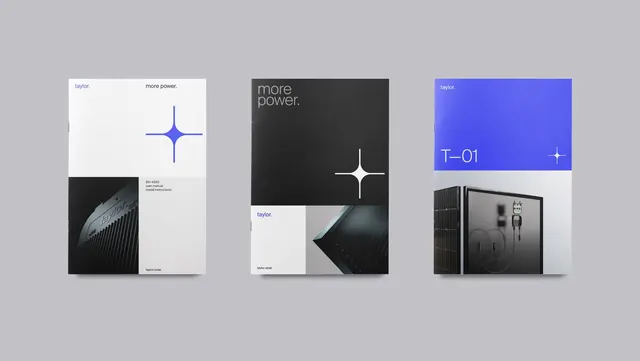
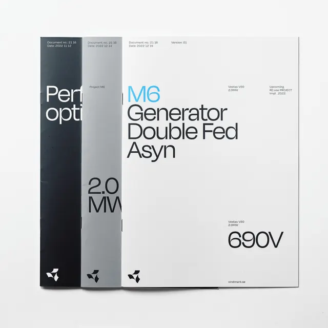
Technical typeface branding using high-contrast split coloring (dark/light panels) with sans-serif specimen text showing font weights, specifications like 2.0MM and 690V.
Summary
Technical font identity system displayed as folded panels with dark and light sections showing typeface specimen text, numeric specifications (2.0MM, 690V), and geometric symbol.
Visual description
Three folded panel brochure or identity sheets arranged in perspective. Left panel is charcoal gray with white lowercase sans-serif text reading "Perf Opt" and "2.0" MM in compact layout; small geometric symbol repeats. Center panel is light gray/white with bright cyan-blue text "MG Generator Double Fed Asyn" displayed in regular and bold weights, with supporting specification text below. Right panel shows number "690V" in large sans-serif on white background. All panels share consistent sans-serif typography with varied weights (regular, bold, condensed). Precise baseline alignment and generous margins create Swiss grid-influenced layout. Color-blocking with dark charcoal, white, light gray, and cyan creates sharp technical contrast.
Key takeaway
High-contrast color-split strategy separates type specimen from specs and branding marks; folded-panel format suggests sophistication and print craftsmanship. Technical notation (2.0MM, 690V) conveys precision engineering in the brand identity. Compact sans-serif at small sizes maintains crispness and technical credibility.
Reuse notes
Works for technology, engineering, or precision-manufacturing brands needing serious, authoritative identity. Folded-panel presentation suggests premium collateral or technical manual. Black/white/gray palette suitable for production printing. Not ideal for screen-first experiences; better suited to business cards, specification sheets, or printed guidelines.