Preview image. Unlock full-res
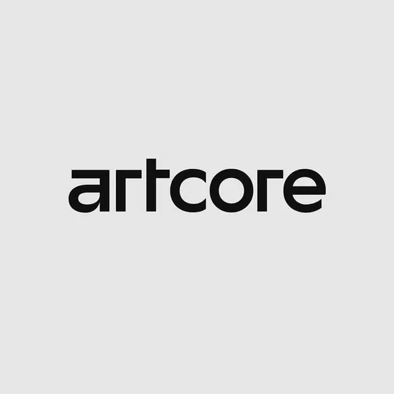
Lowercase wordmark 'artcore' in a geometric sans-serif with uniform stroke weight and sharp terminals on a neutral gray background.
Summary
Lowercase all-caps wordmark in a geometric sans-serif with uniform stroke weight and sharp terminals, centered on a neutral gray canvas.
Visual description
The logotype reads "artcore" in lowercase letters, set in a contemporary geometric sans-serif typeface characterized by consistent stroke weight throughout and sharp, precise terminals on forms like the "r" and "e". The letterforms are pure black (#101010) placed on a light gray background (#E6E6E6), creating high contrast and emphasizing simplicity. The composition centers the wordmark horizontally with balanced negative space above and below, sitting in the upper half of a square canvas. The geometric sensibility is evident in the angular construction of character joins and the mathematical precision of each form.
Key takeaway
The discipline of a single, unified typeface with no decorative elements; the use of negative space to enhance legibility and sophistication; the high-contrast monochrome palette that works at any scale.
Reuse notes
Suitable for tech companies, design studios, creative-services agencies, or any brand positioning itself as contemporary and trustworthy. Works especially well on minimal websites and signage where letterform detail needs to read clearly. The uniform stroke weight ensures reliable reproduction at small sizes.