Preview image. Unlock full-res
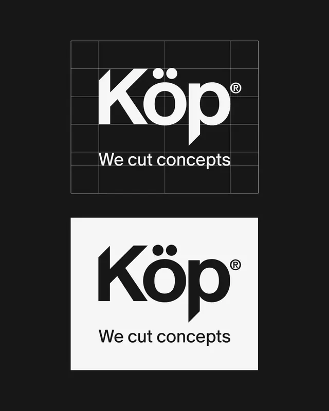
A geometric Köp wordmark shown on its construction grid and as a black-on-white inversion, with the umlaut dots doubling as the only round forms against sharp cut terminals.
Summary
A logo presentation showing the "Köp" wordmark twice: on top in white over near-black with a thin construction grid overlaid, and below in black on a light card. The umlaut over the o sits as two perfect circles, contrasting the angular K and the diagonally cut tail of the p.
Visual description
Two stacked logo lockups on a near-black ground. The upper version overlays a six-by-six light line grid to show how the wordmark is built: the heavy geometric "Köp" reaches the cap line, a small registered-trademark symbol sits at upper right, and the tagline "We cut concepts" runs along a grid line directly beneath. The lower version repeats the lockup on a light off-white panel in solid black, no grid. The custom letterforms are the detail: the K has straight angled strokes, the p terminates in a sharp diagonal cut rather than a curve, and the umlaut dots are the only true circles, giving the mark a single playful beat. Monochrome throughout, no color or imagery.
Key takeaway
Showing the same mark on its construction grid and then clean, on inverted backgrounds, communicates rigor and flexibility in one frame, useful for a logo-reveal slide or a brand-guideline page. The diagonal cut on the p literalizes the "we cut concepts" tagline, a small concept hook that makes the custom letterform feel earned.
Reuse notes
A clean reference for presenting a wordmark in a guideline or case study: pair the gridded version with the inverted clean version to prove construction and contrast at once. Best for an agency, studio, or consultancy that wants a confident, no-color identity. Keep the tagline optically aligned to a grid line as shown so the lockup stays tidy.