Preview image. Unlock full-res
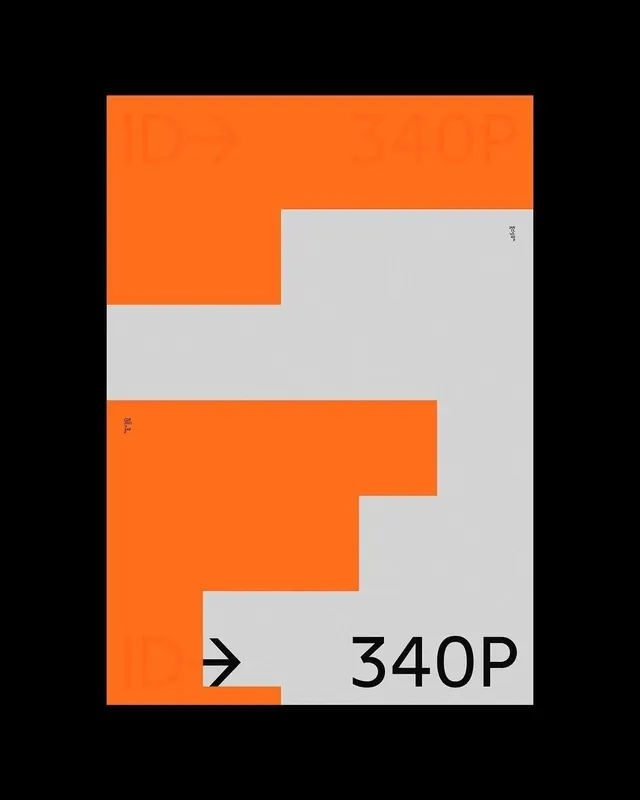
A constructivist identity system built from interlocking orange and gray rectangular forms that create a bold, high-contrast logo mark with a numeric wordmark.
Summary
A constructivist identity system built from interlocking orange and gray rectangular forms that create a bold, high-contrast logo mark with a numeric wordmark.
Visual description
The composition divides the field into two tone-on-tone areas: a black background and a light gray field. Within this, bright orange rectangles stack and interlock asymmetrically, starting upper left and cascading lower right, creating a zigzag movement that reads as forward momentum or an arrow. Interspersed gray rectangles create counter-forms and rhythm. The bottom quadrant shows a right-pointing arrow symbol in black and the text "340P" in black sans-serif, positioned as a wordmark or identifier. The system is tight, geometric, and relies entirely on rectangular planes and sans-serif type.
Key takeaway
The interlocking rectangular logic creates a mark that works as both an abstract composition and a directional symbol. The high orange-on-gray contrast ensures legibility and boldness. The paired asymmetric mark plus numeric wordmark provides a complete identity footprint that scales well.
Reuse notes
Ideal for tech, construction, logistics, or any forward-motion-oriented brand. The constructivist grid style works well in minimalist, tech-heavy contexts. The geometric forms tile and compose, so the system can extend to patterns and supporting graphics.