Preview image. Unlock full-res
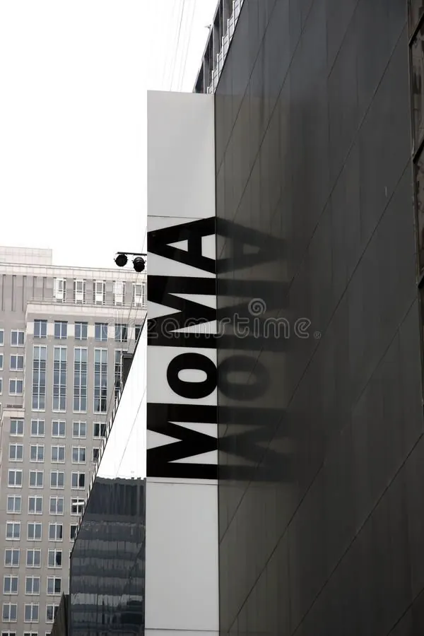
Vertical black sans-serif type reads down a white and dark charcoal facade, using strong geometric planes and monochromatic contrast as the wayfinding strategy.
Summary
Vertical black sans-serif type reads down a white and dark charcoal facade, using strong geometric planes and monochromatic contrast as the wayfinding strategy.
Visual description
Architectural wayfinding sign mounted on a multi-plane facade. Bold black sans-serif letters read vertically down a white rectangular panel, bisecting the frame. The letters are evenly spaced, creating a strong rhythm along the height of the facade. Behind the white panel, a dark charcoal building surface recedes in angled planes, with a thin horizontal black bar dividing the white and dark areas. The background shows a modern institutional building across the street and a sky above. Harsh overhead lighting creates shadow and depth.
Key takeaway
The discipline of vertical reading using monochromatic geometry; the white panel as a frame that isolates the typography from the complex architecture behind it. The bold sans-serif weight ensures legibility across distance. The contrast strategy relies entirely on black, white, and medium gray without any additional color.
Reuse notes
Strong model for institutional and corporate identity systems, wayfinding design, and architectural signage. The vertical orientation works for building-mounted displays, interior museum galleries, and any context where the sign must read from a distance. Best paired with clean, modern architecture; the monochromatic approach avoids clashing with colorful urban contexts.
More like this




Keep what you find
A free account saves references to boards and can send you a weekly email of picks based on what you save.
To see every result, go Pro.