Preview image. Unlock full-res
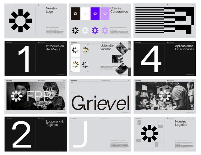
A nine-panel brand guide displaying logo variations, color system, iconography, numbered hierarchy, and typeface usage over black and white.
Summary
A structured presentation grid showing a brand identity system including logo mark, icon set, color compositions, numbered typography scales, and black-and-white photography pairings.
Visual description
Nine thumbnails arranged in a 3x3 grid. Top-left: radial star logo centered on light gray. Top-center: five circular icon variations and their applications. Top-right: bold horizontal stripe pattern in black and white. Middle-left: large white "1" on pure black with small credit text. Middle-center: small icon variations in mustard, olive, and gray tones. Middle-right: abstract photographic grid in grayscale. Bottom-left: large white "2" on black. Bottom-center: abstract letterforms and geometric shapes on light gray. Bottom-right: large white "4" on black, "Grievel" wordmark centered between. All panels maintain strict black-white or light-gray color discipline. Typography is sans-serif, all-caps where present. Photographs are desaturated and geometric, not portrait-oriented.
Key takeaway
Pure black-and-white grid establishes immediate sophistication and scalability. Icon-system shows variation without chaos (constrained palette, consistent stroke weight). Numbered sections (1, 2, 4) signal hierarchy and sequencing without need for prose. White typography on black creates maximum authority. Grid itself is the composition tool, not additional decoration. Photography is cropped geometrically and desaturated, not aspirational.
Reuse notes
Template for corporate identity documents, pitch decks, or design-system specifications. Works for fintech, legal, analytics, or other industries needing instant credibility and precision. The stripe pattern, numbered sections, and icon families are all modular and easy to adapt. Requires strong geometric logo and constrained color palette to avoid looking boring. Not suitable for playful or emotional brands.
More like this





Keep what you find
A free account saves references to boards and can send you a weekly email of picks based on what you save.
To see every result, go Pro.