Preview image. Unlock full-res
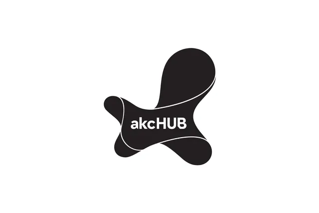
Abstract black logo of flowing organic shapes suggesting a hub or nodal connection, with thin white lines anchoring the curves.
Summary
Abstract black monogram of three flowing organic bulbous shapes, anchored by fine white contour lines and separated by white negative space, centered on a light ground with the wordmark 'akcHUB' positioned within the upper center shape in sans-serif type.
Visual description
The mark consists of three interlocking curved forms in solid black, arranged asymmetrically. Each shape is a loose capsule or teardrop with slightly inflated edges. Fine white line work traces the negative space between them, creating compartments that hold the type, suggest motion, and emphasize the hand-drawn quality of the geometry. The wordmark 'akcHUB' sits embedded in the upper-left bulb in a neutral sans-serif. The logo is centered on a white background, creating a strong monochrome figure-ground relationship. The shapes read as organic, fluidly connected—like nodes or molecules linked together.
Key takeaway
The contrast between organic, bulbous forms and hard-edged white geometric partitions. The use of embedded typography within the mark itself rather than set separately. The rhythm of variable-width negative space creating a sense of movement and flow without any actual curved strokes in the contours.
Reuse notes
Strong for tech, platform, or community brands seeking a modern mark that feels human and approachable rather than rigid. The organic geometry reads as friendly while still being clean. Works best at larger scales where the negative-space line work remains crisp.