Preview image. Unlock full-res
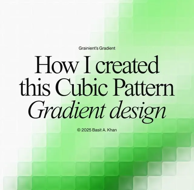
A cover design with a monolithic serif headline 'How I created this Cubic Pattern Gradient design' centered over an animated-looking cubic grid pattern in white to bright green tones.
Summary
A cover design with a monolithic serif headline 'How I created this Cubic Pattern Gradient design' centered over an animated-looking cubic grid pattern in white to bright green tones.
Visual description
A title page with a large, centered serif headline in black, italicized subhead, and credit line centered below. Behind and filling the entire lower half is a cubic isometric grid rendered as overlapping squares in a gradient from off-white in the upper left corner through pale green, medium lime, darker green, and finally saturated kelly green in the lower right. The gradient is smooth but not solid; the square pattern creates a sense of depth and motion, suggesting dimensionality. Small text at top reading 'Grainient's Gradient' anchors the pattern explanation. All type is black or white, ensuring high readability.
Key takeaway
The cubic grid gradient does all the visual work: it is complex and eye-catching yet stems from a simple constraint, a single geometric shape tiled and color-shifted. Pairing it with minimal, centered serif type lets the pattern speak. The cream-to-green palette reads fresh and youthful without screaming; it softens geometric abstraction.
Reuse notes
Works well as a title page, process post, or design methodology explainer. The cubic pattern is trendy but not date-specific; the serif/italic combination stays legible and editorial. Avoid using the pattern on small scales or where detail matters; the effect requires breathing room.
More like this


Keep what you find
A free account saves references to boards and can send you a weekly email of picks based on what you save.
To see every result, go Pro.