Preview image. Unlock full-res
Three geometric logo concepts demonstrating visual perception states: a stable single form, a reversible figure-ground pair, and an ambiguous interlocking pattern.
Summary
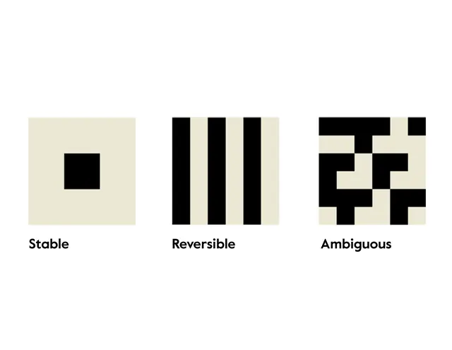
Three side-by-side geometric studies labeled stable, reversible, and ambiguous, each using stark black rectangles on cream to explore visual perception and design intent.
Visual description
A three-column layout on a cream background with sans-serif black labels below each section. The left column "Stable" shows a single centered black rectangle, the most reductive form. The center "Reversible" column displays three vertical black bars with cream gaps, creating a simple alternating pattern. The right "Ambiguous" column presents interlocking black and cream forms that create competing figure-ground readings, where the eye can read either the black or cream shapes as foreground. All three use strict geometric forms with no curves, arranged in a horizontal grid.
Key takeaway
A conceptual approach to logo design that explicitly documents the intentional ambiguity or stability of a mark. The terminology (stable, reversible, ambiguous) frames design choices as semantic decisions. The high-contrast monochrome palette forces clarity and makes the geometric relationships undeniable. The side-by-side comparison format demonstrates depth of thinking in design process work.
Reuse notes
Excellent framework for brand identity explorations, design case studies, or educational materials on visual perception. The reversible and ambiguous studies are particularly strong for tech, data, or analytical brands seeking to signal intelligence or nuance. Use this format when wanting to show design research or conceptual rigor in a portfolio or pitch.