Preview image. Unlock full-res
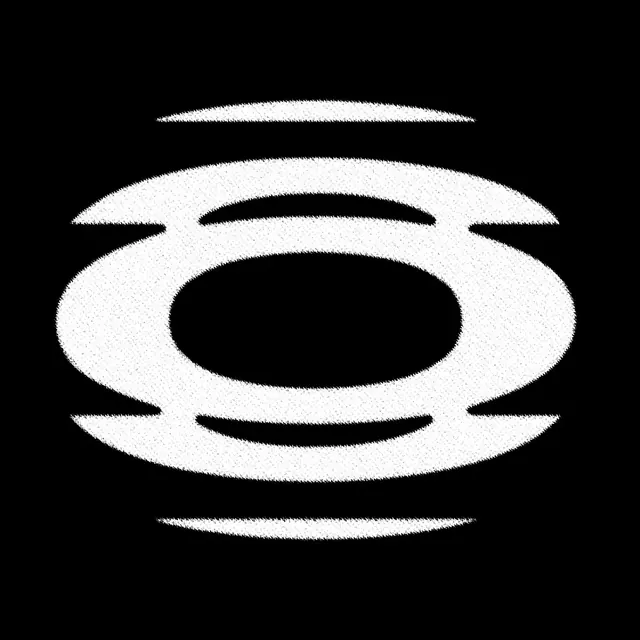
Monochromatic abstract logo built from overlapping curved lines forming a circular composition with a centered asterisk, suggesting rotation or orbital motion.
Summary
Monochromatic abstract logo built from overlapping curved lines forming a circular composition with a centered asterisk, suggesting rotation or orbital motion.
Visual description
Centered black mark on white ground. The logo consists of two to three curved strokes arranged concentrically, creating an orbital or rotating impression. The thick, even-weight lines form a series of wavy arcs that overlap and weave, creating depth through layering rather than color. At the center sits a six-pointed asterisk or star, aligned on the horizontal and vertical axes. The entire mark fits neatly in a circle, balanced and symmetrical.
Key takeaway
The layered line technique creates apparent movement and 3D depth without solid fills or gradients. The centered asterisk is a simple, recognizable counter-mark that anchors the composition. This approach is scalable from large display down to favicon-size without losing legibility.
Reuse notes
Excellent for tech, finance, or scientific brands needing a sophisticated, abstract mark. The minimalist line-work reads well at small sizes and works equally on light or dark backgrounds. Works best when paired with modern sans-serif type; the geometric purity suits brands claiming innovation, precision, or forward motion.