Preview image. Unlock full-res
A stark, minimal monochrome identity system combining geometric shapes with a photographic portrait element and a geometric dot pattern.
Summary
A stark, minimal monochrome identity system combining geometric shapes with a photographic portrait element and a geometric dot pattern.
Visual description
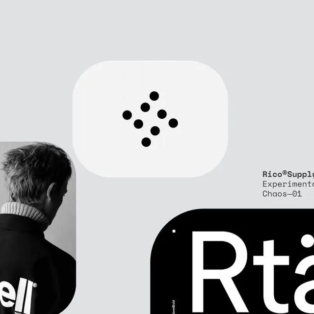
The composition integrates a grayscale photographic profile portrait on the left with geometric abstract elements on the right. A rounded-rectangle speech bubble shape in light gray contains a seven-dot grid pattern rendered in black dots arranged in a diamond formation. Below is a bold black rectangle with white sans-serif text reading "Rt21" in a condensed, geometric typeface. The overall layout balances the organic human form against strict geometric precision, with generous white space and a pure black-white-gray palette. The aesthetic is contemporary corporate with quiet, focused energy.
Key takeaway
The combination of photography with abstract geometric marks to create visual intrigue; the use of a dot pattern as a memorable secondary identity element; the stark color contrast and breathing room that makes minimal type feel authoritative.
Reuse notes
Strong reference for tech, startup, or B2B identity work where sophistication and precision matter. The photographic element adds humanity to geometric minimalism, making it work well for people-focused brands. The dot pattern translates across applications (favicon, mark variant, background texture).