Preview image. Unlock full-res
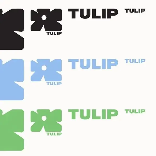
A three-color modular type system with geometric bow-tie forms and structured sizing hierarchy, demonstrating brand consistency across variations.
Summary
A modular type system repeating the word "TULIP" in black, light blue, and green, each paired with a matching geometric bow-tie form and scaled text variations, demonstrating brand component reusability.
Visual description
Three horizontal rows on a white background, each repeating the same modular unit: a bold black (or colored) rounded geometric form with a white circle negative space in the center (bow-tie or hourglass shape), followed by the word "TULIP" in large all-caps sans-serif block letters, then a smaller version of "TULIP" in lighter weight. The pattern repeats in three color families: black, light blue, and sage green. Negative space is used consistently to separate each component element, suggesting modular reuse and component-library thinking.
Key takeaway
The ability to show a single gestural form (the geometric mark) translating predictably across a color palette, reinforcing brand memory. The sizing hierarchy of text within a single line (full-size plus subordinate label) as a pattern for guided use. The whitespace treatment as a design language, not just spacing.
Reuse notes
Excellent for tech companies, SaaS, or design-forward brands wanting to show systematic thinking and modularity. Works well in brand-book contexts, design-system documentation, or component showcases. The three-color approach keeps the system legible without being prescriptive; easily extendable to more colors. Best displayed at scale to appreciate the geometric form detail.
More like this






Keep what you find
A free account saves references to boards and can send you a weekly email of picks based on what you save.
To see every result, go Pro.