Preview image. Unlock full-res
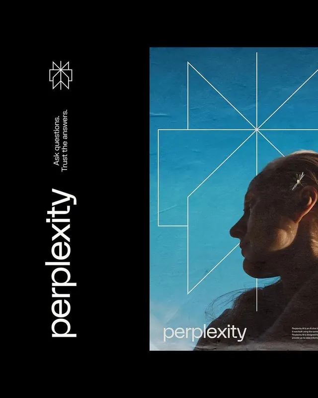
A brand identity for Perplexity combining a geometric star-like line-art logo, cool teal color field, photographic portraiture, and oversized sans-serif typography with philosophical messaging.
Summary
A brand identity for Perplexity juxtaposing a geometric line-art logo and vertical type on a black field with a teal-tinted photographic portrait divided by white geometric line overlays.
Visual description
Vertical composition split left-right: left side (dark background) features a geometric logo composed of radiating white lines forming an eight-pointed star shape, paired with vertical justified sans-serif type reading "Ask questions. Trust the answers." in white, with the Perplexity wordmark below in a custom angular sans-serif. Right side shows a profile portrait of a woman's face against a luminous teal-blue background, overlaid with white geometric line structures (a grid of diagonal and vertical lines forming diamond and rectangular shapes). The portrait is cropped to show only the head and upper shoulder against pure teal, with the geometric overlay extending edge-to-edge. Small gray caption text appears bottom-right. The stark black-to-teal transition creates dramatic visual contrast and implies the split between human inquiry and computational intelligence.
Key takeaway
The vertical split composition: it segregates brand identity and messaging (left, minimal, geometric) from product or humanity context (right, photographic, complex). The geometric line overlay on photography creates visual continuity between the abstract logo and photographic anchor. The tagline "Ask questions. Trust the answers" in all-caps justified type is distinct, memorable, and reinforces the brand promise. Teal as a non-traditional tech color (cooler than blue, warmer than cyan) feels contemporary and trustworthy.
Reuse notes
Strong template for AI, search, or intelligence platforms needing both technical credibility and human-centered messaging. The split layout works well in marketing collateral, pitch decks, and website hero sections. The geometric line motif can be easily applied to icons, illustrations, and UI elements. Best paired with bold photographic imagery; illustration or abstraction on the right side would dilute the impact. The black background is essential for the teal to read with full vibrancy.
More like this



Keep what you find
A free account saves references to boards and can send you a weekly email of picks based on what you save.
To see every result, go Pro.