Preview image. Unlock full-res
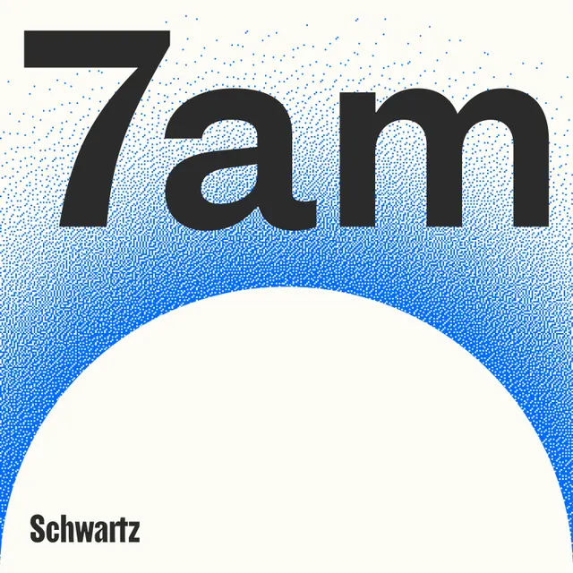
Type specimen featuring bold sans-serif '7am' lettering in black against a smooth blue-to-white gradient, demonstrating a clean display typeface in a minimal composition.
Summary
A type specimen showing a bold display sans-serif rendered as "7am" in black over a vibrant blue-to-white gradient, demonstrating clean, modern letterforms in a minimal composition.
Visual description
The composition centers a single line of black sans-serif type reading "7am" positioned in the upper third of the frame. Below and behind the text, a smooth gradient transitions from a saturated royal blue at the top, through medium blue, to an off-white at the bottom, creating a curved wave effect. A small text label "Schwartz" appears in the lower left corner. The typeface is bold, geometric, and confident, with generous letter-spacing and consistent stroke weight throughout.
Key takeaway
The controlled use of gradient as a supporting background rather than a decorative pattern, letting the typography remain the clear focal point. The bold weight and geometric proportions of the typeface create high legibility over a complex background. The subtle time-of-day semantic (7am) adds personality without competing visually.
Reuse notes
Ideal as a showcase for display typefaces, particularly those with strong geometric construction. Works well in digital contexts (apps, interfaces, marketing) where contrast and clarity matter. The gradient technique is reusable for other type-first compositions, though the saturated blue limits pairing to cool-palette brands.
More like this



Keep what you find
A free account saves references to boards and can send you a weekly email of picks based on what you save.
To see every result, go Pro.