Preview image. Unlock full-res
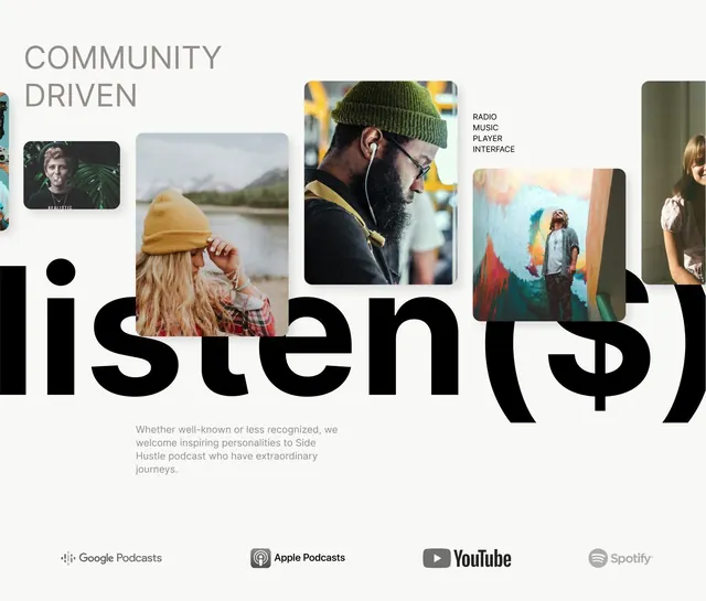
Side Hustle podcast branding pairing a bold black sans-serif wordmark with photographic vignettes and pastel typography showcasing diverse listeners.
Summary
A podcast identity system combining a monumental black sans-serif wordmark with candid lifestyle photography and muted supporting text to convey community and authenticity.
Visual description
The brand employs asymmetric hierarchy: a large black sans-serif wordmark "listen" anchors the composition as the main visual element, while top-aligned supporting text "COMMUNITY DRIVEN" sits in medium-weight gray. Five cropped photographs of listeners (wearing headphones, beanies, glasses, natural outdoor and indoor settings) are arranged in scattered rectangular frames across the layout, creating narrative depth. A single solid black circle and black vertical rectangle serve as secondary graphic marks. Muted gray descriptive copy runs beneath, grounding the community narrative. Platform icons (Google Podcasts, Apple Podcasts, YouTube, Spotify) appear at the bottom in grayscale.
Key takeaway
The stark contrast between the monumental wordmark and small human photographs creates intimacy at scale. The scattering of portraits (rather than a grid) avoids corporate polish and feels more organic and editorial. The combination of one massive typographic statement with restrained secondary graphics (solid shapes, icons) prevents visual noise.
Reuse notes
Strong for podcast, audio, media, or community-focused brands where showing real people matters. The photography approach works best when you have diverse, authentic portraits to work with. Keep the wordmark isolated on clean backgrounds; reserve the photo vignettes for layouts where narrative context adds value.
More like this





Keep what you find
A free account saves references to boards and can send you a weekly email of picks based on what you save.
To see every result, go Pro.