Preview image. Unlock full-res
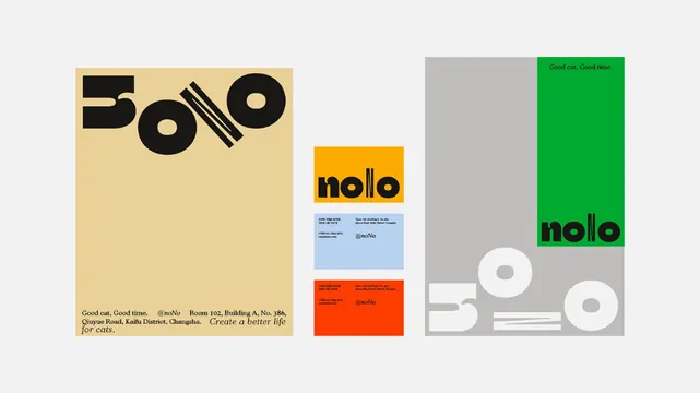
A modular identity system for Nolo restaurant using bold geometric sans-serif wordmarks displayed across color-blocked layouts in mustard, red, green, and neutral gray tones, with supporting typography and circular badge elements.
Summary
A comprehensive identity system for Nolo restaurant, presenting the geometric black wordmark across three modular layouts using mustard, red, and green color blocks, with neutral supporting elements and abstract circular forms.
Visual description
The specimen is divided into three distinct sections, each demonstrating wordmark placement and color application. The left panel uses a large mustard-yellow background with black letterforms, paired with small body copy and brand information. The center section presents two stacked variations: the wordmark on a bright golden-orange bar above fine print, then a second arrangement on red. The right panel shows the mark and tagline "Good eat. Good time." set against a split gray and vibrant green background, with two abstract white circles positioned as supporting design elements. Typography throughout is clean and sans-serif. The color palette progresses from warm tones (mustard, orange, red) to cool accents (green) grounded by neutrals.
Key takeaway
The geometric wordmark's simplicity allows flexible color treatment across the palette without losing legibility. The layering of the wordmark with abstract circular forms creates visual interest without complexity. The modular grid structure (showing the mark in contained color blocks rather than floating) demonstrates professional application without requiring elaborate photography or illustration.
Reuse notes
Excellent for food and beverage, startup, or lifestyle brands seeking a clean, approachable identity. The warm color palette and friendly geometric language work well for casual dining or community-focused businesses. Consider the three-color spread as a template for presenting brand colors; the circular forms can be adapted as secondary marks or icon elements. Avoid overcomplicating with additional textures or patterns; the strength lies in geometric purity and bold color.
More like this



Keep what you find
A free account saves references to boards and can send you a weekly email of picks based on what you save.
To see every result, go Pro.