Preview image. Unlock full-res
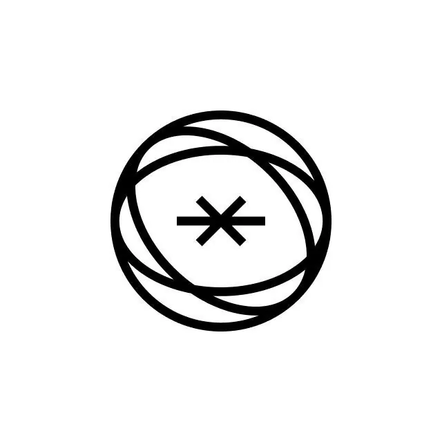
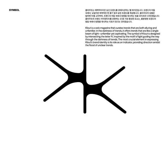
Minimalist logo for Klout, a web magazine about trends, using sharp intersecting strokes to form an abstract mark.
Summary
Minimalist symbol for Klout, a trend-curation web magazine, built from three intersecting black strokes that form an open, dynamic abstract mark on white.
Visual description
Three bold black strokes intersect at the center, creating a cross-like yet organic form with acute angles and gaps that define empty space. The composition is perfectly centered on white. The strokes vary slightly in thickness and length, creating visual tension. "SYMBOL" text appears at the top left, and a block of English and Korean copy sits to the right explaining the design intent: the mark's role as a directional indicator amid trend chaos.
Key takeaway
Economical use of thick strokes and negative space to suggest motion and complexity. The intersection points create a focal core while the extended arms break the frame, implying scale beyond the mark itself. Perfect for a brand needing precision and dynamism without ornamentation.
Reuse notes
Works best for tech, media, or trend-focused brands where sharp geometry and movement matter. High contrast ensures legibility at any size. The open form reads equally well in solid or outlined contexts.