Preview image. Unlock full-res
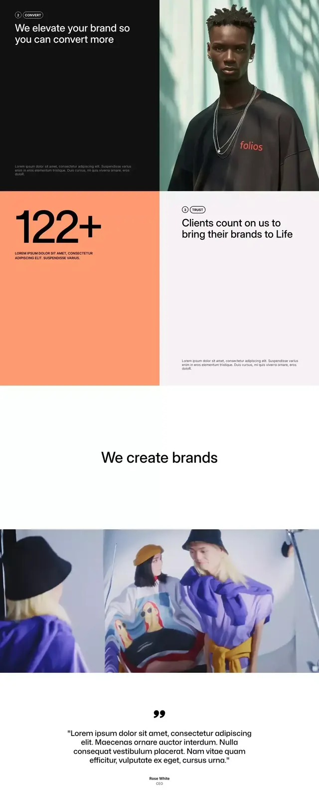
Multi-section branding specimen for a consulting firm, mixing bold serif headlines, minimalist stats, photography, and a vibrant accent orange against white and neutral space.
Summary
A consulting-firm branding system spanning headline serif, supporting sans-serif, large stat callouts, color-blocked orange zones, and lifestyle photography of diverse teams.
Visual description
The specimen flows vertically through five distinct sections: a bold serif headline "Empowering Brands to Engage and Thrive" (with a colorful accent on "Thrive") anchors the top; a purple-tinted stat section highlights "13%" with supporting body text; a large orange rectangle sits isolated on a white background; a "122+" callout overlays the same orange with more copy; a centered "We create brands" byline; mood photography showing people in professional settings; a purple section with small text and icon clusters; finally a dark/black footer with large serif type encouraging "Let's Create Something Remarkable" in a minimal layout. The palette alternates white expanses with concentrated accent zones in orange and purple.
Key takeaway
Effective use of oversized stats as compositional anchors; strategic color blocking (orange and purple as value-add, not everywhere); generous whitespace that lets typography and small image moments breathe; shifting from serif headlines to sans body to icon density keeps visual rhythm dynamic; photography integrated not as background but as discrete section breaks.
Reuse notes
Strong for service-based businesses (consulting, creative, healthcare) needing to convey expertise and human warmth in parallel. The orange accent works because it is truly sparse and deliberate. Serif/sans pairing reads premium without being precious. Resizing for mobile requires careful attention to stat callout dimensions and photo placement.
More like this




Keep what you find
A free account saves references to boards and can send you a weekly email of picks based on what you save.
To see every result, go Pro.