Preview image. Unlock full-res
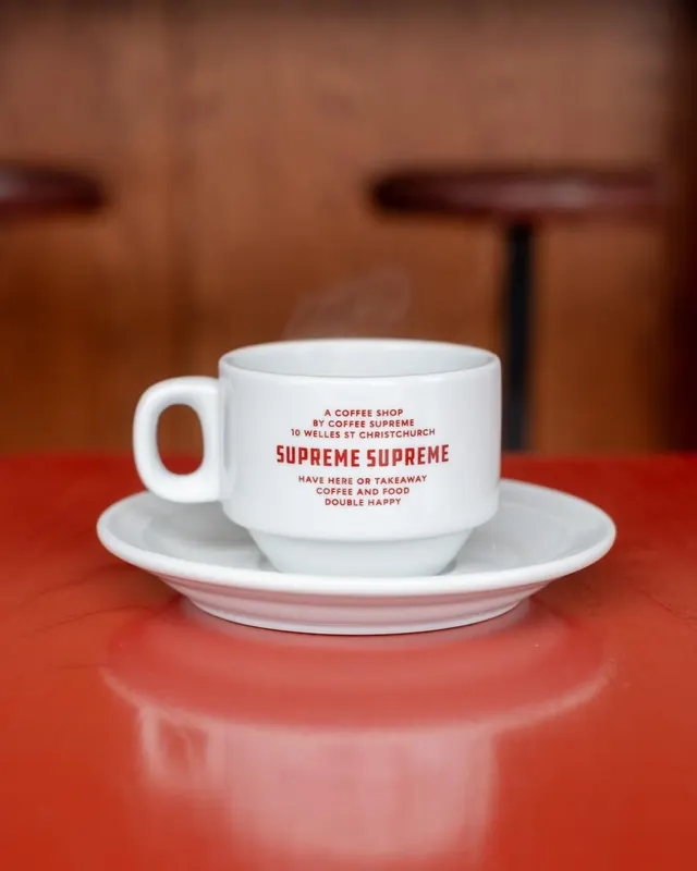
Branded ceramic coffee cup and saucer with red text on white, positioned on a burnt-orange surface against a blurred warm interior.
Summary
White ceramic cafe cup and saucer printed with red sans-serif text identifying the coffee shop and its location, sitting on a warm burnt-orange surface.
Visual description
Centered composition: a white porcelain cup with a rounded body sits on a matching white saucer. Red all-caps sans-serif text stamped on the cup reads "A COFFEE SHOP / BY COFFEE SUPREME / 10 WELLES ST CHRISTCHURCH / SUPREME SUPREME / HAVE HERE OR TAKEAWAY / COFFEE AND FOOD / DOUBLE HAPPY". The saucer has a pink underglaze. A bright coral-red table surface occupies the lower third. Blurred warm-brown interior (wood, cafe shelving) fills the background. Soft depth of field softens the surroundings and emphasizes the cup as the focal point.
Key takeaway
Typography as primary branding: cramming the entire cafe story (location, promise, personality) into tableware text in one sans-serif face scales identity down to the smallest touchpoint. The red-on-white contrast ensures legibility at any size or distance. The warm color temperature (rust-tone surround, pink underglaze) creates cohesive mood even though the cup itself is neutral.
Reuse notes
Effective for food/beverage venues where the customer will hold the branded object; the tactile / repeated exposure justifies the copy density. Avoid on dark ceramics. Works well paired with warm environmental color (cafe wood, rust, terracotta) rather than clinical white. The all-caps sans creates a friendly, unpretentious feel despite the dense informational load.