Preview image. Unlock full-res
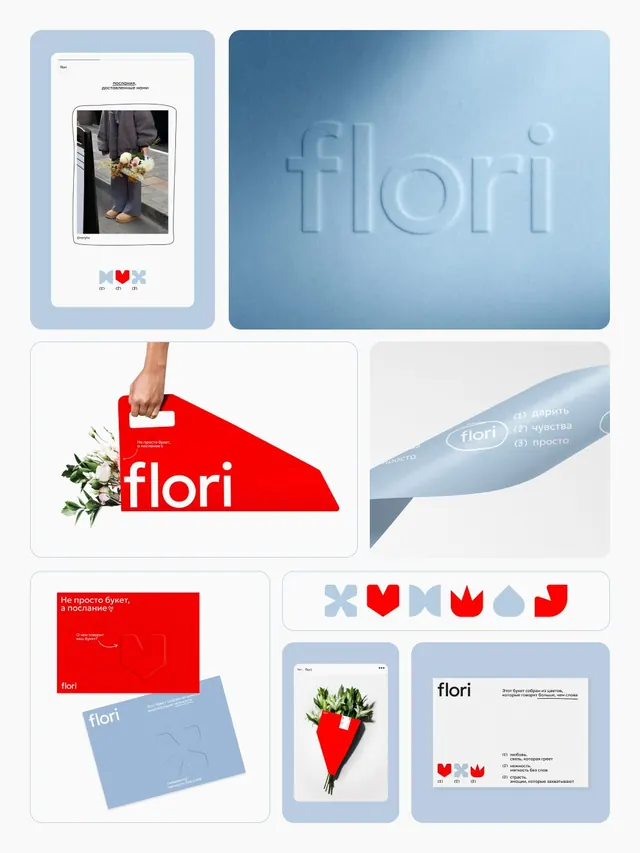
Brand system for Flori, a flower delivery service, pairing soft blue and red geometric icons with embossed blue backgrounds and red shopping-bag packaging.
Summary
Brand system for Flori, a flower delivery service, pairing soft blue and red geometric icons with embossed blue backgrounds and red shopping-bag packaging.
Visual description
A six-panel mood board showcasing the Flori identity. Top left: a soft-blue rounded card with a framed flower photo and three geometric icons (heart, X shape, tulip) in red and blue below. Top right: embossed "flori" logotype on a gradient blue background. Middle left: red shopping-bag handle with white "flori" wordmark and real flowers. Middle right: blue folded ribbon or tab with "flori" and Russian text listing services. Bottom row: red business card or mailer with white "flori" and blue ribbon accent; a smartphone showing a red flower arrangement; a blue reference sheet with logo and usage guidelines. The palette throughout is consistently soft blue, red, white, and light gray, with sans-serif typography anchoring each application.
Key takeaway
The paired complementary colors (soft blue and bold red) create visual separation between branding and e-commerce elements. Embossed and textured typographic treatments elevate a simple palette. The emoji-like geometric icon set (heart, X, tulip) is memorable and works at thumbnail scale on packaging and digital.
Reuse notes
Ideal for lifestyle e-commerce and retail brands where premium positioning meets approachability. The geometric icon system works well for product categories or service tiers. Works strongest on cool-toned backgrounds; red accent demands restraint to avoid visual noise.