Preview image. Unlock full-res
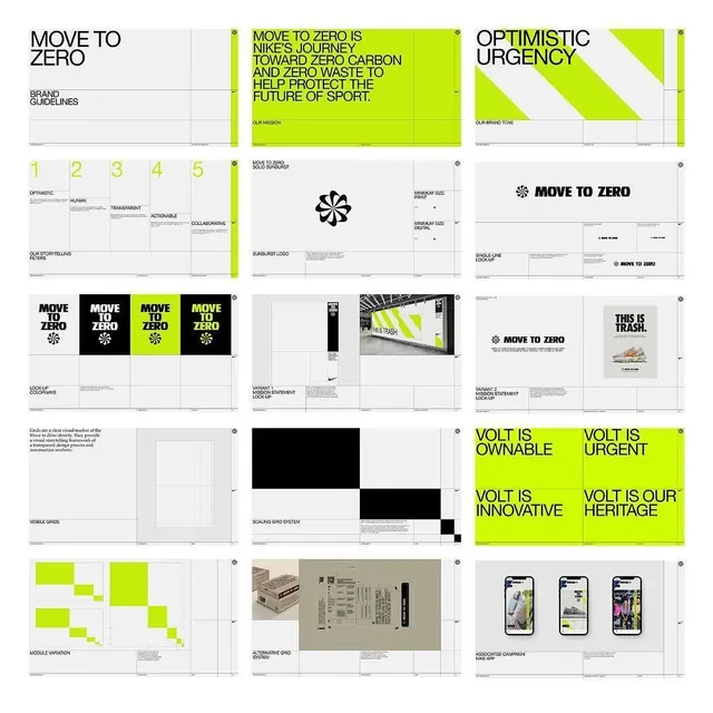
Nike's sustainability-focused brand system built on high-contrast neon-lime and black with gridded layouts, geometric logo, and bold sans-serif typography.
Summary
Nike's Move to Zero sustainability initiative brand system, defined through structured grids, bold black-and-white layouts, and electric lime-green accents that communicate urgency and environmental action.
Visual description
A brand guidelines collection showing multiple pages of the Move to Zero system: headline pages with lime-green backgrounds and high-contrast black text declaring campaign messages ("Move to Zero is Nike's journey toward zero carbon and zero waste"); a geometric four-point star logo with variations across colored and monochrome backgrounds; logo lockups at different scales; numbered typographic scales (1-5) defining hierarchy and use; a three-by-two grid of solid lime, white, and black swatches with mood descriptors (Optimistic, Humanoid, Transparent, Collaborative, Actionable); application mockups of sunglasses, packaging, and social channels; a visible-grids system showing the underlying structure; alternative organic and geometric mark systems; and supporting materials. The overall aesthetic is urgently minimal, with lime-green as a non-negotiable system accent.
Key takeaway
The electric accent-color strategy that breaks a monochrome system without diluting it, the simplified geometric logo device that works as both mark and pattern, and the integration of a messaging framework (campaign taglines, brand tone) into the visual guidelines.
Reuse notes
Strong for mission-driven or sustainability-focused brands seeking an urgent, direct aesthetic. The lime-on-black contrast is high-legibility and high-energy, suitable for digital and print campaigns. The geometric logo is simple enough to scale down but distinctive enough to anchor a complex system.
More like this





Keep what you find
A free account saves references to boards and can send you a weekly email of picks based on what you save.
To see every result, go Pro.