Preview image. Unlock full-res
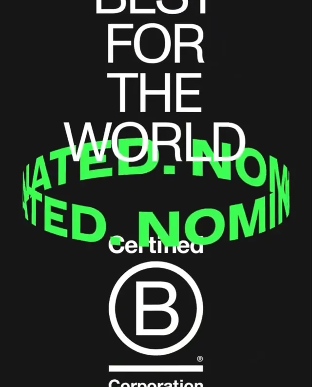
Stacked white and neon-green typographic composition announcing a B-Corp 'Best For the World' certification, anchored by an official badge.
Summary
A typographic seal certifying "Best For the World" via B Corp nomination, layering neon-green skewed text over white sans-serif headlines on solid black, with the official B-Corp circular badge at the bottom.
Visual description
The composition centers on a tall, vertically stacked text hierarchy against pure black. At top, white sans-serif in all-caps reads "BEST FOR THE WORLD." Beneath it, the phrase "RATED.NOM" is rendered in bright neon green (#3BFA51), skewed and overlapping the white text to create dynamic movement and depth. Lower, in small white sans-serif, sits "Certified." The B-Corp circular badge (a white circle enclosing a serif "B") anchors the bottom with a thin white rule above and below, emphasizing official status. The neon-to-white color contrast is stark and intentional, making the certification claim impossible to miss.
Key takeaway
The skew-angle neon overlay creates movement and modernity while keeping the design stark and scannable. The circular badge at the bottom provides instant visual recognition of the certification's legitimacy. Stacking white and neon in all-caps makes the claim read loud without a logotype.
Reuse notes
Perfect for sustainability-marketing, b2b, or ecommerce brands that carry B-Corp or third-party certifications and want to broadcast them boldly. The bright neon works best on dark backgrounds. Scale this to hero sections, certificate assets, or digital badges where the certification is a marketing point.
More like this





Keep what you find
A free account saves references to boards and can send you a weekly email of picks based on what you save.
To see every result, go Pro.