Preview image. Unlock full-res
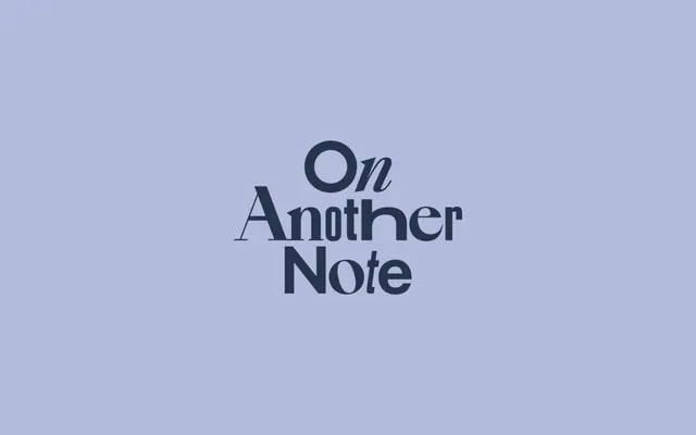
Centered serif typeface specimen against a muted blue-purple background, emphasizing elegant letterforms and refined typographic hierarchy through color contrast and generous white space.
Summary
A centered serif display specimen against a muted blue-purple background, balancing dark letterforms against cool, restrained color to convey editorial refinement.
Visual description
The text "On Another Note" in a classical serif display typeface is centered against a solid muted blue-purple background. The letterforms are rendered in dark navy-charcoal, creating strong contrast with the cool background. The composition is spare, relying entirely on vertical and horizontal typographic positioning to establish hierarchy and rhythm. The generous negative space above, between, and below the words emphasizes the letterforms themselves as the sole visual content, allowing the serif character and weight variations to communicate quality and tradition. The palette is monochromatic in feeling, uniting background and type through cool temperature alone.
Key takeaway
The strategy of using color temperature (cool muted background) rather than brightness alone to establish type contrast. The editorial restraint of a single centered line of large type in open space. The subtle interplay of different serif weights across the text.
Reuse notes
Strong for editorial, publishing, or typographic-focused brand specimens. Works especially well when the typeface itself is the hero and the brand voice is quiet, established, or literary. Avoid for playful or warm-toned brands.
More like this







Keep what you find
A free account saves references to boards and can send you a weekly email of picks based on what you save.
To see every result, go Pro.