Preview image. Unlock full-res
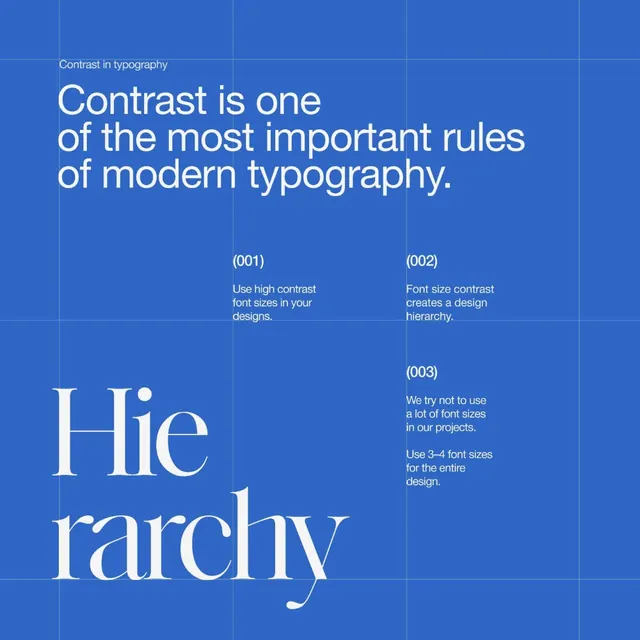
Educational type specimen demonstrating contrast as a core principle of modern typography, using large serif display type against a grid-structured blue ground.
Summary
A typographic instruction piece using oversized serif type paired with numbered callouts to explain contrast as a fundamental rule of modern typography on a structured blue field.
Visual description
A medium-blue background is overlaid with a subtle white grid. Large, elegant serif type reading "i lie rarchy" dominates the left side of the composition, set in white and scaled to nearly fill the vertical space. Above, smaller white sans-serif text reads "Contrast is one of the most important rules of modern typography," anchoring the principle being demonstrated. On the right, three numbered notes (001, 002, 003) in smaller sans-serif text explain specific contrast applications: using high contrast in font sizes, font weight, and avoiding too many font families. The overall layout balances the massive letterforms against precise, readable type hierarchy.
Key takeaway
The strategy of using the design itself to embody the rule being taught (large type demonstrating contrast); the grid as an underlying organizing structure that does not intrude; the pairing of oversized display type with small explanatory notes as a teaching device.
Reuse notes
Excellent template for design guidelines, brand standards, or educational materials. The blue-and-white palette is neutral and professional. Works well printed or digital. The model of showing a rule through example rather than just stating it is highly reusable for other typographic or design principles.
More like this






Keep what you find
A free account saves references to boards and can send you a weekly email of picks based on what you save.
To see every result, go Pro.