Preview image. Unlock full-res
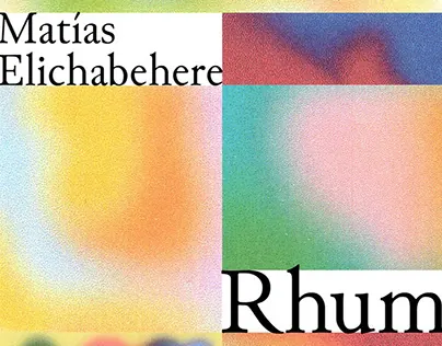
A minimalist logo and branding system using soft color-block rectangles (peach, yellow, mint, pink) with typographic labels demonstrating color-driven identity.
Summary
A minimalist logo and branding system using soft color-block rectangles (peach, yellow, mint, pink) in a 2x2 grid with typographic labels demonstrating color-driven identity.
Visual description
Four soft-gradient color blocks arranged in a square grid: peach-to-white gradient (top left), warm yellow-to-white (top right), mint-to-pink (bottom left), and deep pink-to-blue (bottom right). The brand name "Matias" is set in black sans-serif in the top-left corner; "Elichaberere" wraps along the top edge. A second instance shows "Rhum" as a secondary mark, suggesting this system is modular and can be applied to multiple products or sub-brands. The gradients are soft and blended rather than hard-edged, creating a contemporary, approachable feel.
Key takeaway
Using soft-gradient color blocks as the primary identity mark, with type as a secondary element. The modular grid allows the same system to scale across products. The gradient treatment adds visual depth without becoming complex. Each block's unique blend-to-white direction makes the grid feel purposeful rather than arbitrary.
Reuse notes
Ideal for multi-product brands, design studios, or color-forward portfolios where color is the hero. The soft gradients read as contemporary without feeling dated. Adapt the grid size (2x2, 3x3, or linear sequence) depending on how many color values you want to express. Works across applications from logos to packaging to web backgrounds.
More like this



Keep what you find
A free account saves references to boards and can send you a weekly email of picks based on what you save.
To see every result, go Pro.