Preview image. Unlock full-res
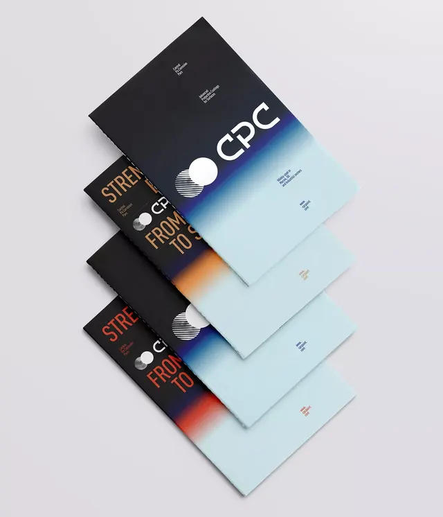
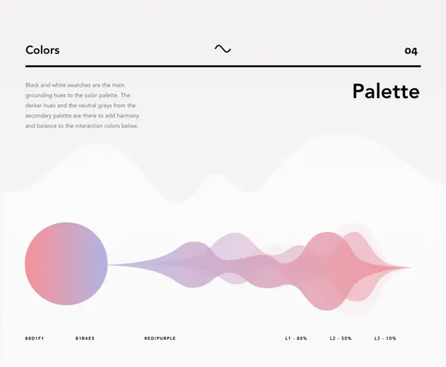
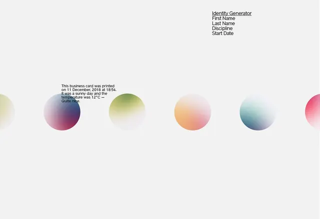
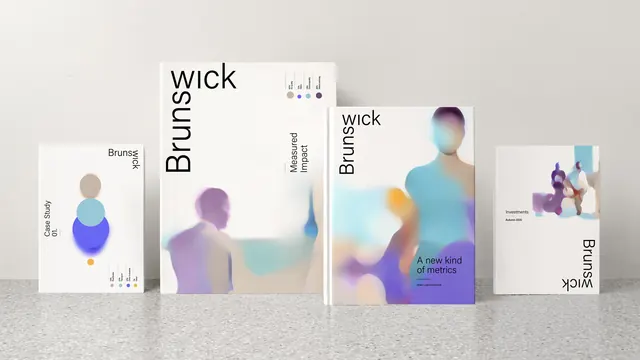
A comprehensive brand identity system using soft pastel gradients with stacked circular elements, showcased across collateral and book covers.
Summary
A refined consulting brand identity system using soft, overlapping pastel gradients and stacked circular forms across publication collateral and book covers.
Visual description
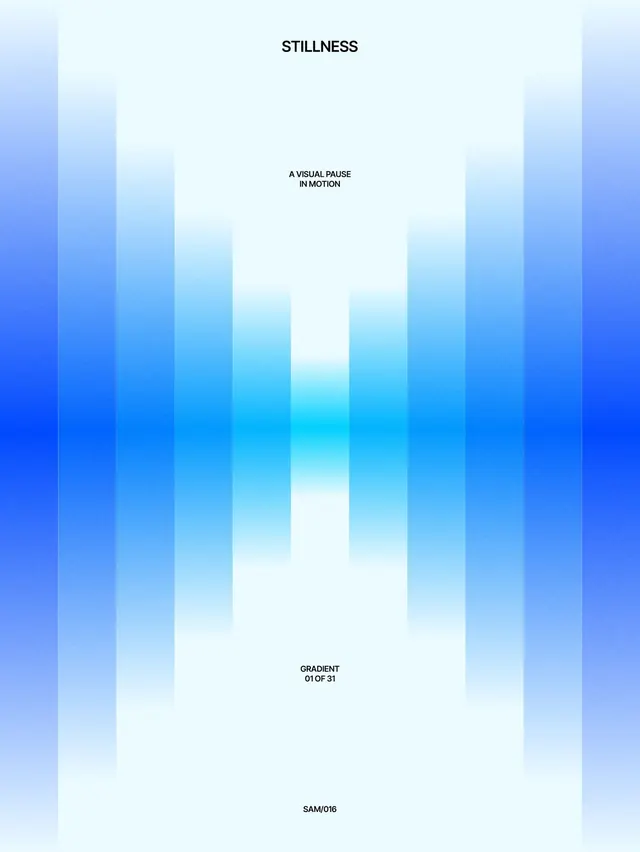
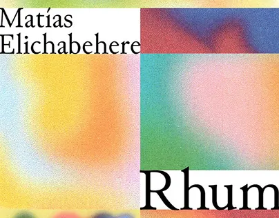
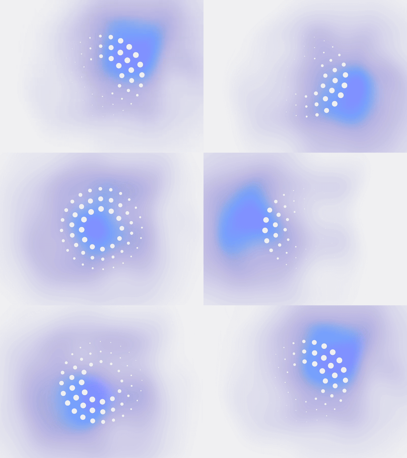
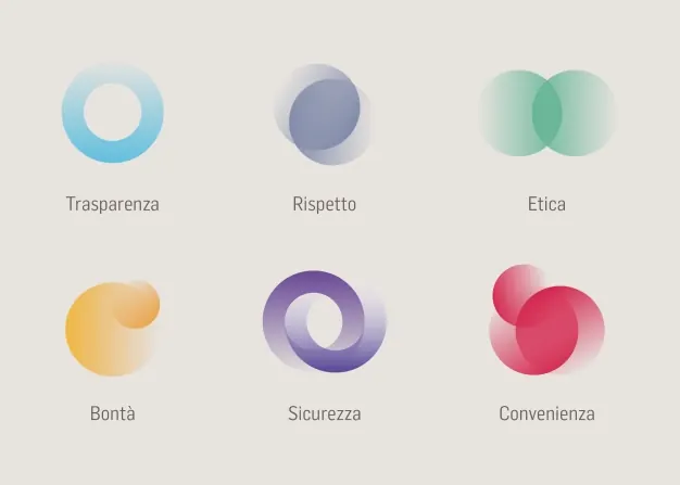
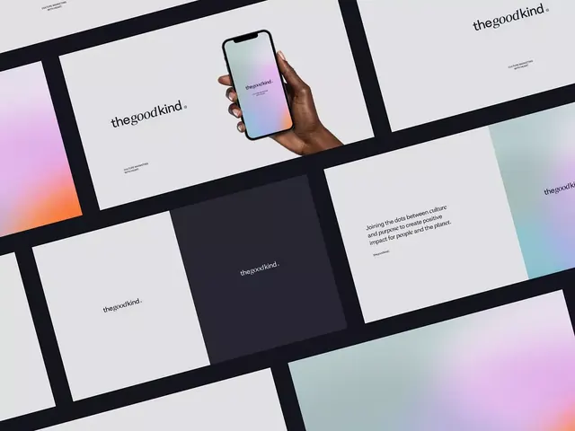
A set of branded collateral pieces laid out on a neutral surface, each featuring a cohesive gradient language: beige/cream backgrounds paired with soft gradients in muted lavender, soft blue, yellow, and coral tones. The core identity uses stacked, translucent circular elements in layered gradients (tan to purple to blue, or blue to yellow). Book covers and case study cards repeat this grammar at different scales; the right-most piece shows a headless figure rendered in gradient form against a darker background. Text is set in clean sans-serif, either in a vertical/rotated axis or horizontal, paired with small color swatches to indicate the palette range. The overall effect is serene and contemporary, leaning toward editorial/consulting aesthetic.
Key takeaway
The stacked gradient-circle mark is instantly recognizable and scales seamlessly across formats. The soft pastel palette and color-swatch diagrams provide a confident, methodical branding language that works equally well on book covers, case studies, and web. The rotated-text treatment adds visual interest without sacrificing legibility.
Reuse notes
A strong reference for consulting, agency, or publishing brands seeking a calm, sophisticated visual identity. The gradient-blob approach is modern without trendy excess. Works particularly well for process-heavy or research-driven services where a thoughtful color system signals rigor and trust.