Preview image. Unlock full-res
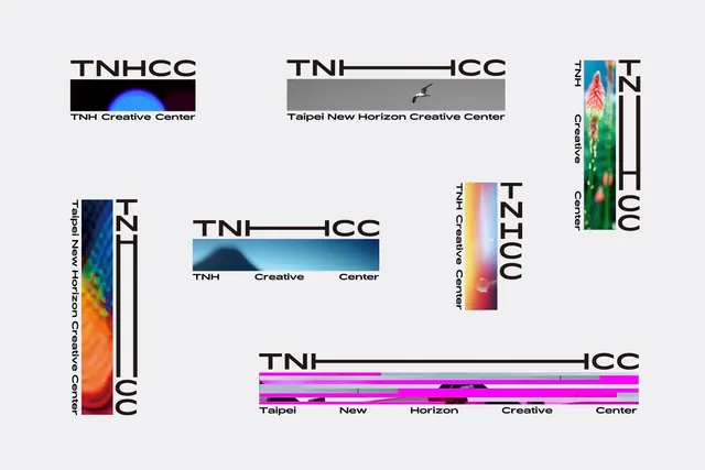
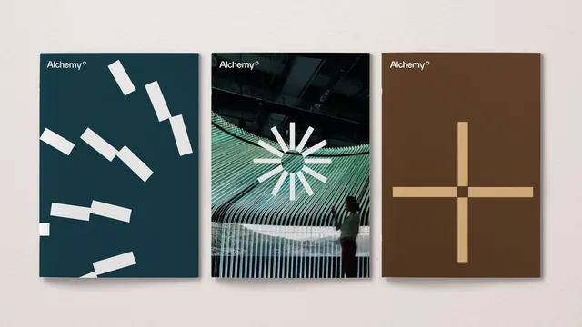
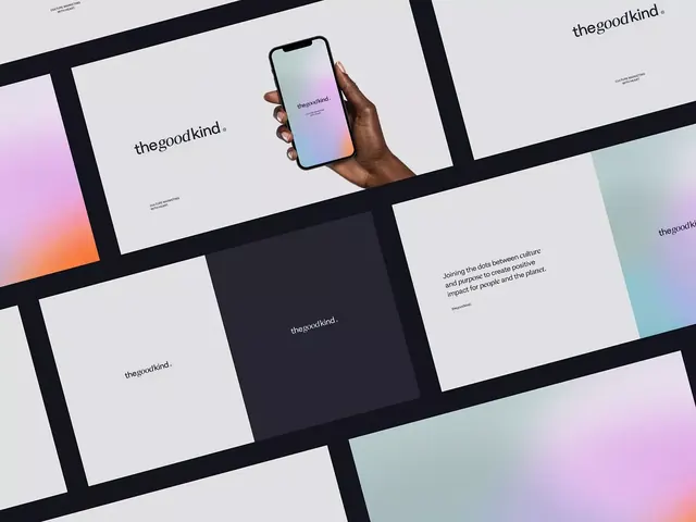
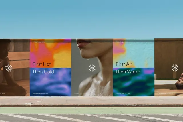
A modular grid layout using distinct color-blocked panels with sensory imagery and sans-serif labels to organize a multi-concept design showcase.
Summary
A modular grid layout using distinct color-blocked panels with sensory imagery and sans-serif labels to organize a multi-concept design showcase.
Visual description
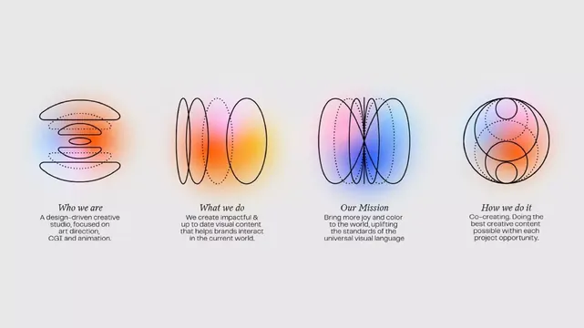
A horizontal sequence of narrow vertical panels, each a self-contained composition. Panels alternate between solid teal backgrounds with labels and rich photographic or gradient content (warm skin tones, ocean blues, thermal oranges and purples, browns). White sans-serif labels appear at the top of each panel. The "Framework" label bookends the left; "Framework" repeats on the right. The central image shows a close-up human profile. Gradients transition from orange and magenta through blues and teals. A small white icon (pinwheel or sun-like shape) sits above each gradient block. Temperatures appear annotated (74°C, 105°F, etc.). The overall effect is a sensory mapping system where each color block represents a different tactile or thermal experience.
Key takeaway
The modular grid system that contains disparate content (photography, gradient, text) in equal-width vertical bands. The consistent placement of icons and labels creates rhythm without monotony. Using color, temperature labels, and imagery to communicate intangible concepts (sensory experiences) clearly.
Reuse notes
Strong pattern for portfolios, sensory brands, thermal/climate systems, or any concept-heavy showcase needing visual order. Works best with genuine photographic or gradient variety rather than repetitive patterns. Scale each panel width to fit your content without crowding the labels.