Preview image. Unlock full-res
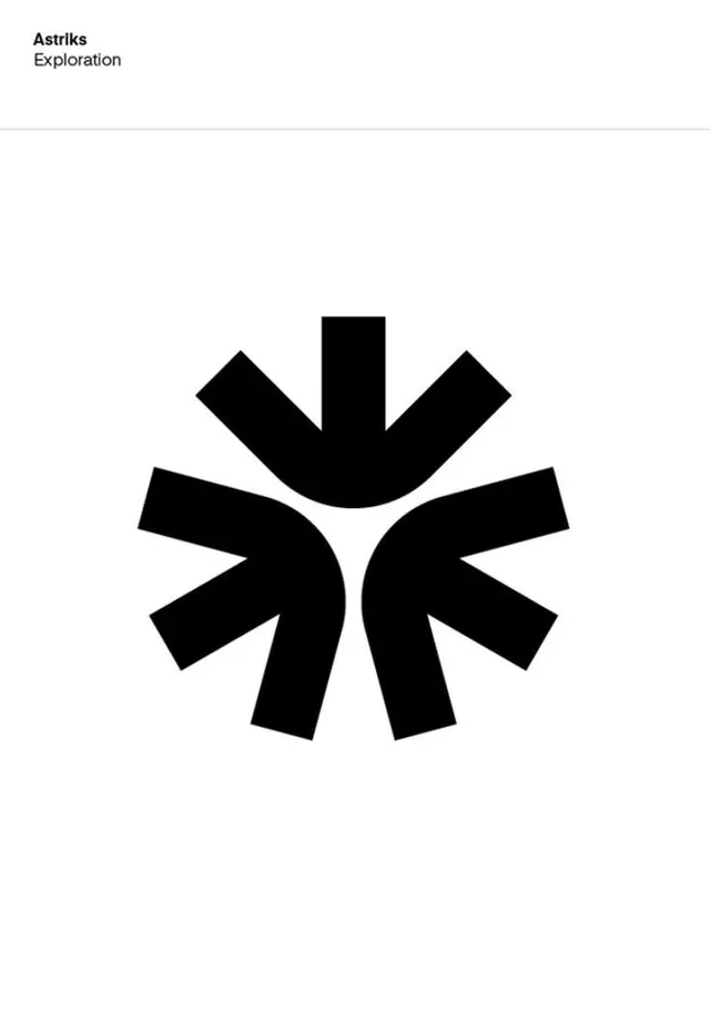
Astriks Exploration logo: solid black abstract mark of eight angular arms fanning from a central void, resembling a compass rose, asterisk, or branching exploration network.
Summary
A minimal logo mark for Astriks Exploration: eight solid black tapered arms radiating from a small central void, reading as both a compass rose and an abstract exploration symbol, paired with a clean sans-serif wordmark above.
Visual description
Eight thick, tapered shapes (resembling triangles or arrow heads) fan outward from a pinpoint center, arranged in perfect 8-fold radial symmetry. Each arm points to a cardinal or intercardinal direction and tapers as it radiates outward, creating a sense of extension and outward momentum. The shapes are rendered in solid black with sharp edges, creating high contrast against the white page. Above the mark, the wordmark "Astriks" is set in a tight, contemporary sans-serif bold (all caps), with "Exploration" as a smaller, lighter descriptor underneath. The composition is centered, with generous white margins surrounding it.
Key takeaway
The 8-fold radial symmetry is instantly recognizable and memorable at any scale. The tapered arms (thicker at the core, thinning toward the edge) add visual interest and suggest motion without animation. The solid black rendering is economical and prints clean. The restrained sans-serif wordmark with structured lowercase descriptor (rather than competing with the mark) establishes authority while letting the icon lead.
Reuse notes
Ideal for travel, exploration, navigation, or discovery-focused brands. The compass connotation is immediate. Scales well from app icons to signage. Works as a single-color mark, allowing flexible application across many contexts. The symmetry makes it suitable for favicon, app badge, or watermark applications.