Preview image. Unlock full-res
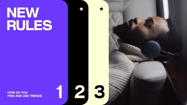
Neon purple and dark typography hierarchy paired with a sequential numbered grid (1, 2, 3) and photographic vignette, demonstrating type scale and rhythm.
Summary
Neon purple and dark typography hierarchy paired with a sequential numbered grid (1, 2, 3) and photographic vignette, demonstrating type scale and rhythm.
Visual description
The composition splits into four sections: an oversized "NEW RULES" headline in bright white on a deep purple background (occupying the left third), and three equal columns showing numbered panels (1, 2, 3) in black and cream against a dark base. Beneath each number sits a photographic crop of textured dark fabric or skin tone, creating rhythmic visual punctuation. The purple-to-black contrast is stark and punchy; the three-column grid establishes a clean cadence that the photography interrupts organically.
Key takeaway
The numbered-sequence grid paired with photography creates visual rhythm that type alone cannot. The three-column system lets each number breathe, and breaking into imagery at the baseline adds tactile weight without overwhelming the typography. This structure works for process guides, hierarchies, or editorial spreads where sequence and visual relief matter equally.
Reuse notes
Ideal for marketing playbooks, brand guidelines, or editorial systems that need to show progression. The neon purple works best when your brand voice is bold or youthful; the dark backdrop is flexible enough for both serious and playful contexts. The numbered callback is strongest when your subject naturally invites counting (steps, rules, eras, versions).
More like this




Keep what you find
A free account saves references to boards and can send you a weekly email of picks based on what you save.
To see every result, go Pro.