Preview image. Unlock full-res
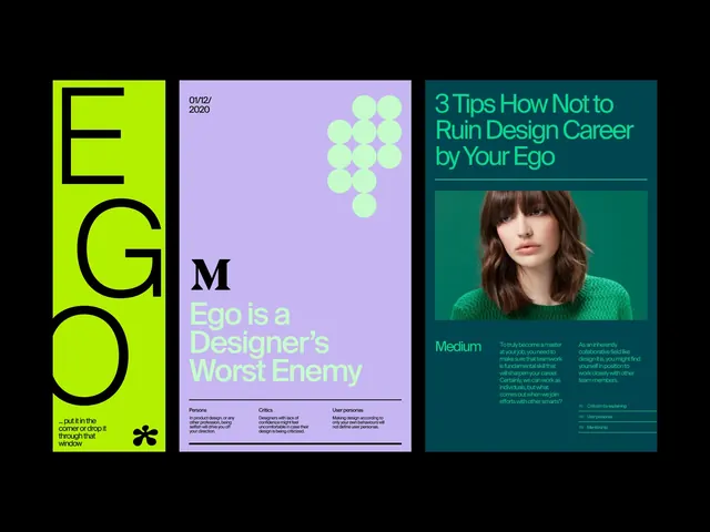
Three-panel publication design with neon yellow, lavender, and teal backgrounds, addressing design career pitfalls through color-blocked typography and portraiture.
Summary
Three cover designs arranged side by side addressing design career mentorship, using lime-green, lavender, and teal as dominant color fields with bold sans-serif typography and portrait photography.
Visual description
A three-panel publication series displayed against black. Left panel: hot lime-green background with large black letters "EGO" stacked vertically, with small explanatory text below and a black asterisk icon. Center panel: soft lavender background with the word "EGO" in lighter weight at top, then the phrase "Ego is a Designer's Worst Enemy" in white and light gray condensed sans-serif, followed by small body text and a pattern of light green circles in the upper right. Right panel: dark teal background with white headline "3 Tips How Not to Ruin Design Career by Your Ego," a color portrait photograph of a woman, and small white body text below. All panels use consistent typography weight and sizing hierarchy, creating a unified system across distinct color fields.
Key takeaway
The direct color-to-context mapping (neon for energy/warning, lavender for reflection, teal for authority); the bold oversized word play on "ego" as both subject and visual anchor; the mix of geometric abstraction (circles, solids) with human portraiture to balance conceptual and relatable messaging.
Reuse notes
Strong for professional development, self-help, and mentorship publishing. The bright neon-against-dark approach works best on glossy stock and commands attention in crowded environments. Portrait placement on one panel only prevents visual repetition while maintaining series cohesion. Scales well from poster to digital presentation.
More like this

Keep what you find
A free account saves references to boards and can send you a weekly email of picks based on what you save.
To see every result, go Pro.