Preview image. Unlock full-res
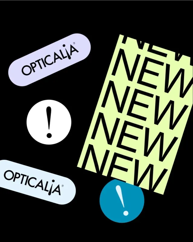
Branding system for Opticalia using neon-yellow geometric blocks, pale-blue rounded containers, and teal punctuation circles to create high-contrast visual hierarchy.
Summary
A branded type system using neon-yellow blocks, rounded pale-blue containers, and teal punctuation circles on black to emphasize key messaging with maximum contrast and visual punch.
Visual description
Black background anchors three distinct branded elements arranged asymmetrically. A pale-blue rounded pill at top-left contains "OPTICALIA" in small black sans-serif. Below it, a white circle with a black exclamation point and dot punctuates the left side. To the right, a large neon-yellow angled rectangle fills with repeated "NEW" in thick, high-impact sans-serif overflowing its edges. Bottom-left shows another pale-blue angled pill with "OPTICALIA" in the same font. A teal-blue circle with a white exclamation point anchors the lower-right corner. All type is bold and condensed, all shapes are geometric and unadorned.
Key takeaway
The restraint of a three-color system creating chaos through scale and placement rather than complexity. The use of geometric punctuation marks (exclamation circles) as branding constants. The rotated rectangular blocks as a structural grid that feels dynamic without pattern-breaking.
Reuse notes
Strong for urgent product announcements, rebrands, or marketing campaigns targeting young, design-forward audiences. Works best at large display sizes. Pair with abundant whitespace; the system itself is loud enough to carry content by itself. The neon yellow demands dark backgrounds and print/web applications with high contrast budgets.
More like this


Keep what you find
A free account saves references to boards and can send you a weekly email of picks based on what you save.
To see every result, go Pro.