Preview image. Unlock full-res
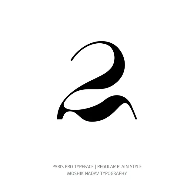
Minimal monoline logomark: a stylized numeral 2 rendered as continuous, fluid curves filling white space with purposeful negative space.
Summary
A monoline logo of a flowing numeral 2, traced as continuous curves in solid black on white, leveraging negative space and line weight to achieve elegance and abstraction.
Visual description
Centered on white, a solid black form rendered as a single continuous line that pulls and swells to suggest the shape of the numeral 2. The upper arc curves gently, thickening at the middle, then pinches inward. The lower loop is wider and fuller, with fluid bulges on both sides. Negative space between the two lobes and at the innermost curves becomes part of the visual rhythm. The line weight varies subtly, giving the mark weight and sophistication. Below the mark, gray text reads "PARIS PRO TYPEFACE | REGULAR PLAIN STYLE" and "MOSHIK NADAV TYPOGRAPHY" in small sans-serif.
Key takeaway
Monoline marks are enduring because they work at all sizes and in all media. The flowing curve strategy here makes a simple number feel premium and contemporary. The consistent line weight (with slight swell) gives presence without heaviness. This is a teaching mark for how minimal geometry can feel luxurious.
Reuse notes
Excellent reference for logomarks that must function across applications, from social profile pictures to large signage. The monoline approach guarantees legibility at reduction. Works best when the number or letter has inherent visual interest (2, 3, 5, R, S). Avoid for marks requiring high contrast between elements; this approach trades variety for cohesion.