Preview image. Unlock full-res
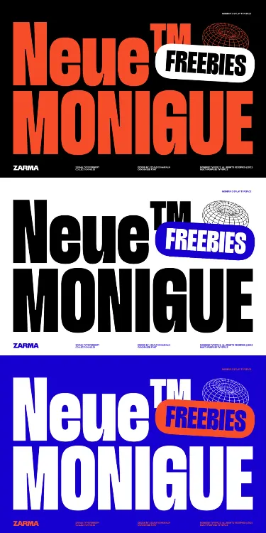
Type specimen showcasing Neue Monique typeface across three color-blocked compositions: red on black, black on white, and white/red on blue.
Summary
A promotional type specimen for the Neue Monique typeface presented in three bold, color-reversed compositions demonstrating how one heavy sans-serif adapts across maximum-contrast color schemes.
Visual description
Three vertical stacks of the same typographic design, each inverting background and foreground. Top: "Neue" in large red-orange sans-serif, followed by a white "FREEBIES" label (with icon) on black background; below, small footer text in Zarma. Middle: identical layout with black type on white background and a blue rounded rectangle behind "FREEBIES". Bottom: white type on a vibrant blue background with an orange rounded rectangle for "FREEBIES". The typeface is a heavy, ultra-compressed sans-serif in all caps, filling nearly the full width of each composition. Each variant demonstrates how a single type family performs across legibility extremes: solid colors on dark/light/saturated backgrounds, always maintaining hierarchy through scale and color.
Key takeaway
The color-inversion approach elegantly documents how type performs across different contrast scenarios without adding typography variations. The rounded rectangle label treatment creates a secondary focal point that breaks up the monolithic type block. The consistent footer structure across all three versions shows how to present type specimens with supporting information at scale.
Reuse notes
Perfect reference for display-heavy branding, music festival posters, or promotional campaigns where urgency and visibility matter. The blue-on-orange colorway is particularly useful for high-energy contexts; avoid on small screens where the compressed letterforms lose legibility. Works well in motion (animating the color shifts) or static print applications.
More like this





Keep what you find
A free account saves references to boards and can send you a weekly email of picks based on what you save.
To see every result, go Pro.