Preview image. Unlock full-res
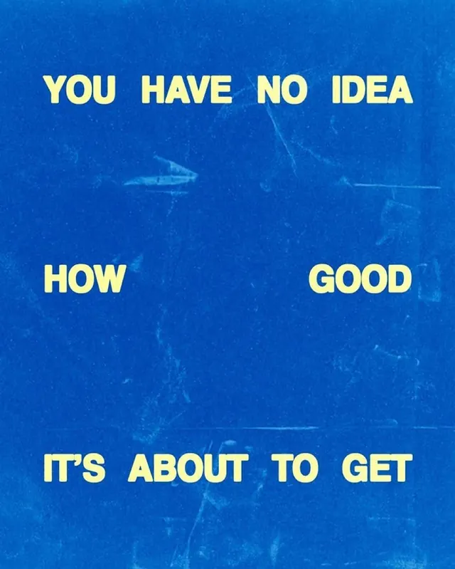
All-caps text composition in soft yellow sans-serif split across a dark blue background, creating urgent, cascading visual rhythm through vertical type placement.
Summary
All-caps text composition in soft yellow sans-serif split across a dark blue background, creating urgent, cascading visual rhythm through vertical type placement.
Visual description
Four lines of bold, all-caps sans-serif type in soft yellow float vertically across a rich, dark blue field. The text reads "YOU HAVE NO IDEA / HOW / GOOD / IT'S ABOUT TO GET" with each line positioned at different horizontal points, creating a descending diagonal movement. The word "HOW" sits alone on the left side, "GOOD" mirrors on the right, compressing the vertical space and creating dynamic tension. The typeface is heavy and condensed, with generous spacing between letters. The blue background has a subtle textured, weathered quality suggesting age or materiality. No other design elements compete; type is the sole visual element.
Key takeaway
The split positioning (left, right, center, right) creates movement and anticipation without animation. Breaking a longer message into separate lines positions each word as a distinct visual element, forcing the viewer to read top-to-bottom and left-to-right. The color pairing (soft yellow on dark blue) achieves maximum legibility and optical warmth against cool ground. All-caps with generous tracking makes even small type readable from a distance.
Reuse notes
Perfect for motivational or promotional messaging, headlines, or situations where you need the viewer to move through the copy sequentially. Works best for short, impactful statements that benefit from vertical scanning. The poster-like density requires confident type and color; avoid if you need nuance or secondary type hierarchy. Pairs well with minimal photography or illustrations in negative space around the text.
More like this





Keep what you find
A free account saves references to boards and can send you a weekly email of picks based on what you save.
To see every result, go Pro.