
Preview image. Unlock full-res
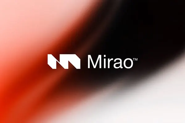
Two-part type specimen pairing an angular geometric plus-mark icon with horizontal bar gradients transitioning from red through coral to blush, against contrasting dark and warm backgrounds.
Summary
A typographic system showing a stark geometric plus-mark icon paired with horizontal gradient bars in two contexts, anchoring a wordmark against black and then a warm gradient ground.
Visual description
Two horizontal layouts stacked vertically. Top: black background with white geometric plus-mark icon (angular, hand-drawn quality) aligned left, followed by a company name in clean sans-serif and a gradient bar running right from bright red through coral-pink to pale blush, all on dark negative space. Bottom: the same icon and text composition replayed against a warm 90-degree gradient ground transitioning from coral-red on the left through orange and peachy salmon, creating a unified color system. The bar element serves as both decorative accent and compositional anchor, unifying both treatments.
Key takeaway
The color strategy of using a single gradient bar to anchor an icon and wordmark, then flipping the background gradient to show the same palette works in both modes. The geometric plus as a memorable icon mark. The discipline of repeating the layout across two backgrounds to demonstrate system robustness.
Reuse notes
Strong for tech or modern-forward brands needing a flexible gradient system. Works well for positioning a geometric mark as the primary brand signal. The red-to-blush gradient is specifically good for contemporary, forward-facing positioning in marketing. Less suited to conservative industries where the vibrance might read as overstated.
More like this





Keep what you find
A free account saves references to boards and can send you a weekly email of picks based on what you save.
To see every result, go Pro.