Preview image. Unlock full-res
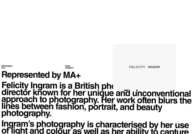
Portrait photographer bio layout with split asymmetric design: bold black sans-serif headline, biography text, contact links, and framed monochrome photograph.
Summary
A split-page type-led biography for photographer Felicity Ingram, pairing dense left-aligned text in bold display type with a minimalist right-column grid showing contact links and a cropped portrait frame.
Visual description
The layout uses a two-column asymmetric split, left-justified text against a near-blank right side. On the left, a small byline sits above a massive black sans-serif headline reading "Represented by MA+" followed by two paragraphs of body copy describing Ingram's photographic approach (composition, light, color use). Contact metadata (email, Instagram) anchors the top-left corner. The right side is mostly empty with a subtle off-white frame containing the photographer's monochrome headshot. All type is black on white; spacing is generous, creating strong visual hierarchy through type weight and negative space rather than color.
Key takeaway
The use of extreme type contrast (tiny metadata plus two-story headline) to create hierarchy without color shifts. The white space on the right gives the dense text room to breathe. The small framed portrait on a sparse side acts as a visual anchor without competing with typography.
Reuse notes
Strong for artist or portfolio bios where the subject's practice description is as important as their image. The bold headline treatment flags the name/brand claim immediately. Works best with compelling copy that fills the text column fully.
More like this






Keep what you find
A free account saves references to boards and can send you a weekly email of picks based on what you save.
To see every result, go Pro.