Preview image. Unlock full-res
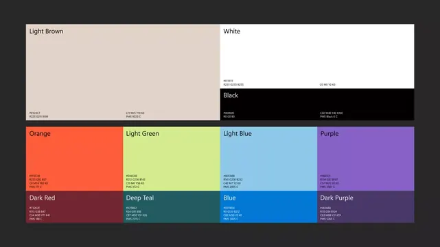
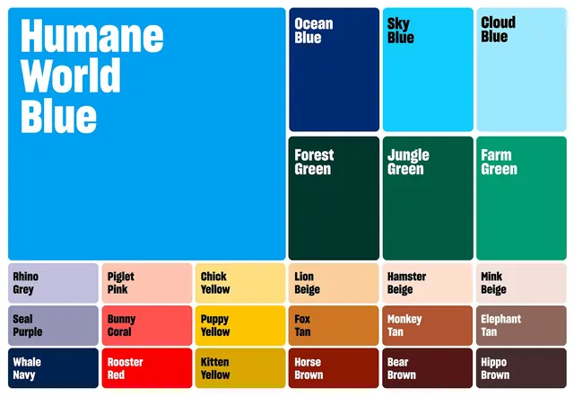
A systematically organized 18-color palette named with natural descriptors, arranged in a grid with typed callouts for quick reference.
Summary
A systematically organized 18-color palette named with natural descriptors, arranged in a grid with typed callouts for quick reference.
Visual description
The palette spans three tiers: a large dominant blue field (Humane World Blue) on the left, a 3x2 grid of secondary colors on the upper right (Ocean Blue, Sky Blue, Cloud Blue across three greens), and a bottom section with 12 smaller tiles in pastels, yellows, oranges, browns, and deep neutrals. Each color swatch is labeled with a semantic name printed in heavy sans-serif type (Rhino Grey, Piglet Pink, Jungle Green, Rooster Red, etc.) anchored at the bottom-right corner. The overall layout prioritizes clarity and taxonomy, using white borders between tiles and consistent label positioning for scanability. Greyed background unifies the presentation.
Key takeaway
Using natural, memorable names instead of hex codes or color numbers makes a palette feel cohesive and usable. The two-column layout (large reference + detailed grid) lets designers quickly anchor on the primary color while accessing variants. Consistent label placement across all tiles enforces a system that works at any scale or reproduction medium.
Reuse notes
Use as a template for brand color documentation. Works well for apps, SaaS products, or guidelines where a broad, friendly color range maps to status, mood, or semantic intent. The naming convention (adjective + base color) is accessible for non-designers and non-English speakers. Pair with usage guidelines showing which variants pair well together.