Preview image. Unlock full-res
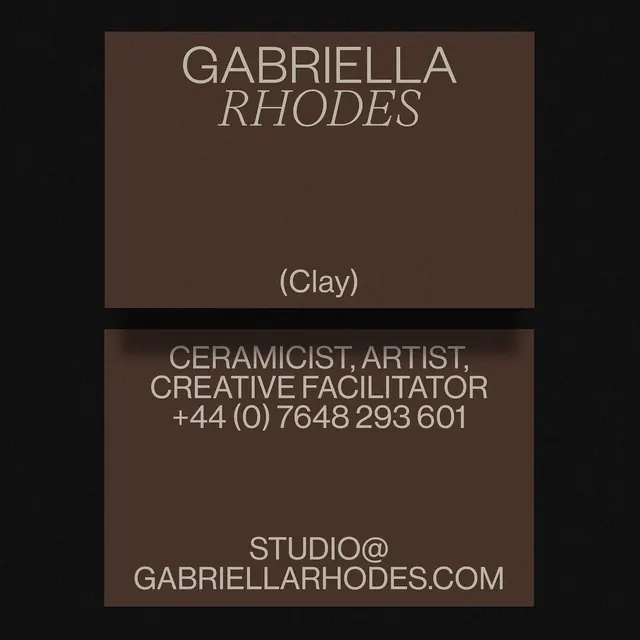
A monochromatic brand card for a ceramicist and artist, using warm brown tones and high-contrast serif typography to signal craft and gallery sensibility.
Summary
A business card identity for ceramicist and artist Gabriella Rhodes with warm brown rectangular blocks stacked vertically, displaying name, credentials, phone, and website in contrasting serif and sans-serif typography.
Visual description
Two stacked rectangular blocks in warm dark brown (approximately #47332A) against a black background. Top block contains name "GABRIELLA RHODES" in large, light serif capitals (likely a serif display face), followed by "(Clay)" in parentheses, also serif. Bottom block, smaller, lists role in all-caps sans-serif: "CERAMICIST, ARTIST, CREATIVE FACILITATOR" followed by a phone number "+44 (0) 7648 293 601" and website "STUDIO@GABRIELLARHO DES.COM" in light sans-serif. All text is rendered in an off-white or cream tone against the brown, creating high contrast. Layout is strictly centered and vertically stacked. The color palette is entirely neutral and warm, with no secondary accent colors.
Key takeaway
The discipline of two typefaces (serif for the name, creating gravitas; sans-serif for credentials, creating clarity) working on a monochromatic, warm-tone background signals craft sophistication without relying on color or imagery. The rectangular block composition is formal and gallery-appropriate. The stacking hierarchy naturally prioritizes the artist's name, moving secondary information down. The brown-on-black combination is distinctive and memorable while remaining economical (true monochrome, nearly printable in one ink).
Reuse notes
Strong fit for craft professionals (potters, jewelers, artisans), visual artists, and gallery directors seeking a gallery-quality identity that feels established and serious. Works particularly well for print business cards and letterheads. The monochromatic approach means the card is economical to produce but requires confident typography to avoid feeling sparse. Not ideal if the brand benefits from secondary colors or photographic imagery; this approach depends entirely on type and tone.
More like this
Keep what you find
A free account saves references to boards and can send you a weekly email of picks based on what you save.
To see every result, go Pro.